When the owners of this traditional villa purchased the property in the upmarket suburb of Merivale, it was the snapshot of old Ōtautahi. With its white timber fence, buxus-bordered garden, intricate fascia and rooftop rooster weather vane, it was “classic Christchurch” from the street. The back, however, was an amalgamation of eras and errors. The 1900s timber home had been through several renovations and extensions in its lifetime, culminating in a poky, unpractical spatial experience. Although the bedrooms – set within the original form – were workable, the communal spaces were “dire”, according to PRau director Phil Redmond. “Bizarre,” offers colleague and architectural graduate Madeleine Clarke.
The living area was in a dark, cave-like nook, the narrow kitchen was isolated around a corner, and the dining table sat in a jazzy, turreted extension that possibly made sense at the time it was built. “It needed a big tidy up,” says Redmond. “We had to redo the interior and add a functional living-kitchen space with a better connection to the backyard.” The owners had been living in Melbourne before they bought, so their references came with an Australian twang. “They were used to the typical Melbourne townhouse alteration made famous by architects like Tom Robertson,” explains Redmond. “So that’s the aesthetic they were looking for: a clean, light, simple and functional home.” While they were keen to retain and refine the heritage of the façade, the back of the home would be a contemporary fix that served the life and style of the young family of four.
Lopping off the offending extensions, Redmond and Clarke simplified matters out back with a slick half-gable-and-box form, arranging the living, kitchen and dining areas within.
Although the home’s 165-square-metre footprint is relatively unchanged, the experience inside is markedly different. The previously cramped and confused home is now light and open – particularly impressive considering PRau snuck in an extra bedroom. The new extension is calm, casual and impressively bright for an east-facing space. A large north-facing window and bi-folding doors to the backyard draw in natural light, but the masterstroke is the clerestory windows. Set high in the half-gable roof, a sloped ceiling delivers that light straight into the kitchen. As any young family can attest, an inordinate amount of time is spent cooking and cleaning, so dedicating this moment to the kitchen – rather than the living or dining area – is a rewarding move.


The owners specified a restrained palette of whites and greys, which gave Redmond and Clarke scope to toy with materiality and texture. The curved, battened wall of the butler’s pantry brings shape and shadow to the space and, on a practical level, holds up well with twin toddlers careening about. “It can feel quite aggressive when you’re coming past a sharp corner every day, in and out,” says Clarke. “So it was nice to soften it.” Formed from a simple pine batten on plasterboard, the cost-effective feature sits alongside a high-spec marble benchtop. “It’s such a balancing act. It could have been cedar and stained, but what would be the payoff?” asks Redmond.
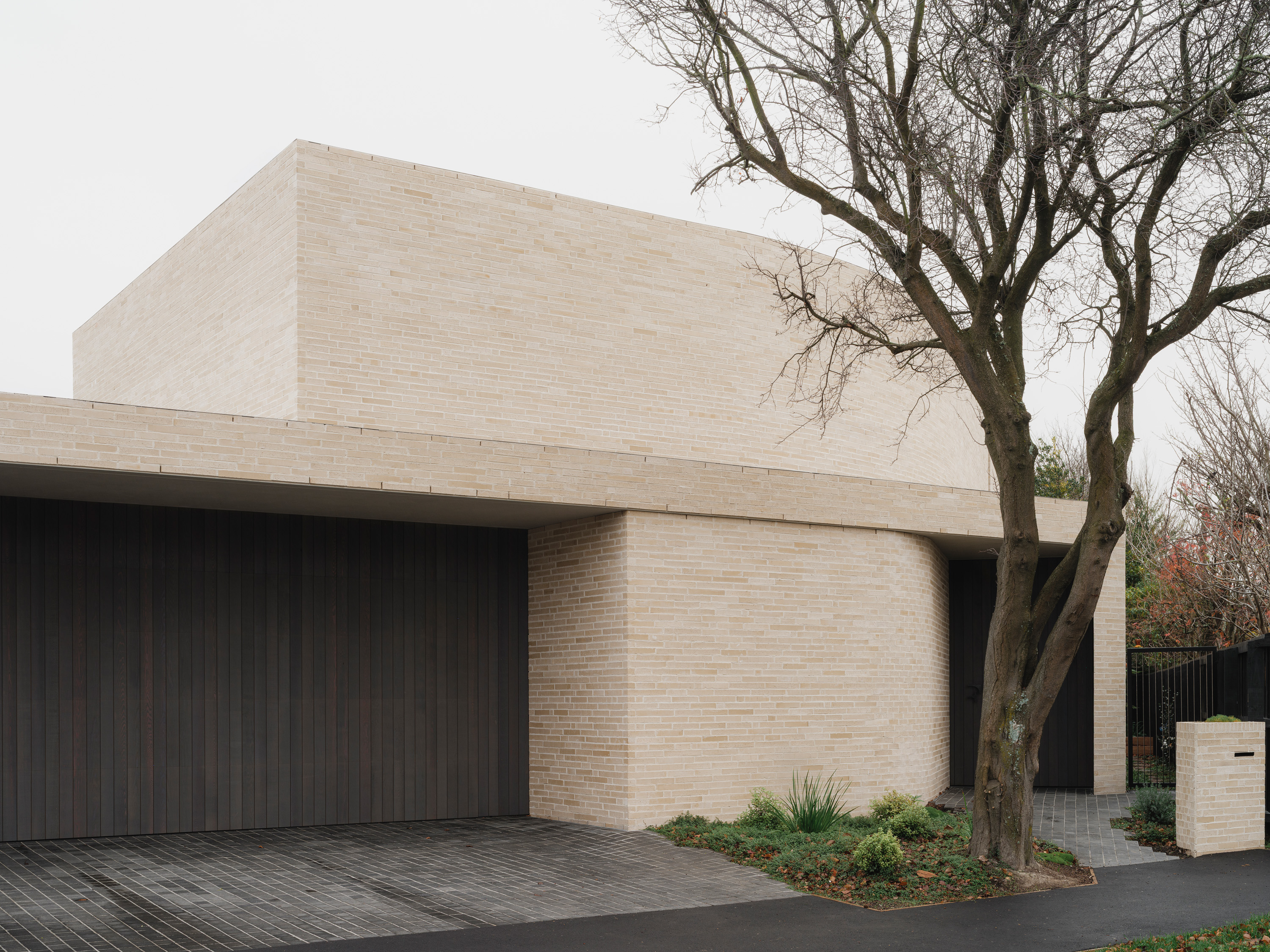
A similar philosophy translates outside, where white brick takes the lead. “There used to be a brick party wall on the property, so it was quite nice to bring in that reference,” says the architect. “We knew the simple form we wanted to create, and then the question was: how can you play with brick to get the same character as the old villa and all its finicky details?” Reimagining the traditional edge lines, rooflines and foundation plinths in brick, the layout explores shadows and scale, making way for bold design moments like a deep-set kitchen window. “Excessive, but cool,” Redmond shrugs.
The plan proved difficult in practice, though. The levels were out, the grout lines were off and painting the bricks wasn’t working. “So in the end, the best option was to go with a solid white brick so they didn’t need to paint-finish it,” explains Clarke. The off-colour grout adds depth to the finish, emphasising the texture, and highlights the brick’s subtle colour-changing quality. “The tone shifts with the light. Today it’s quite cream, but other days it appears more white,” she says. “Keeps things interesting.”
The bi-folding doors have created a new connection to the backyard, where the garden, designed in collaboration with Inside-Out, has started taking hold. The original landscaping was a traditional but high-maintenance jungle of buxus, roses, wildflowers and bay trees that didn’t suit the family’s schedule or style. “They were excited to strip it right back and start from scratch,” says Clarke. Out front, a curved, crazy-paved bluestone pathway weaves through the planting, past a new carport to the front door. Here, an old timber patio has been replaced with mosaic tiles. The pared-back greenery of the garden complements the white villa, allowing the home’s heritage to remain the championing feature; its sharpened surrounds simply accentuate its appeal.
What you see is essentially PRau’s original concept: a refurbished villa with a contemporary tail. The only significant edit, after initial pricing came back a little high, was to shift all of the bathrooms and services to one side, lowering costs. “If you try to imitate the original era or style with these things, it never works, and the overlaid details are hectic,” Redmond reasons. “But if you pare it back, celebrate what’s good about the old and then add the new, it feels much better. Clean, crisp.”


1. Entrance
2. Bedroom
3. Walk-in
4. Ensuite
5. Bathroom
6. Laundry
7. Formal Living
8. Living
9. Kitchen
10. Dining
11. Scullery
Related Stories: