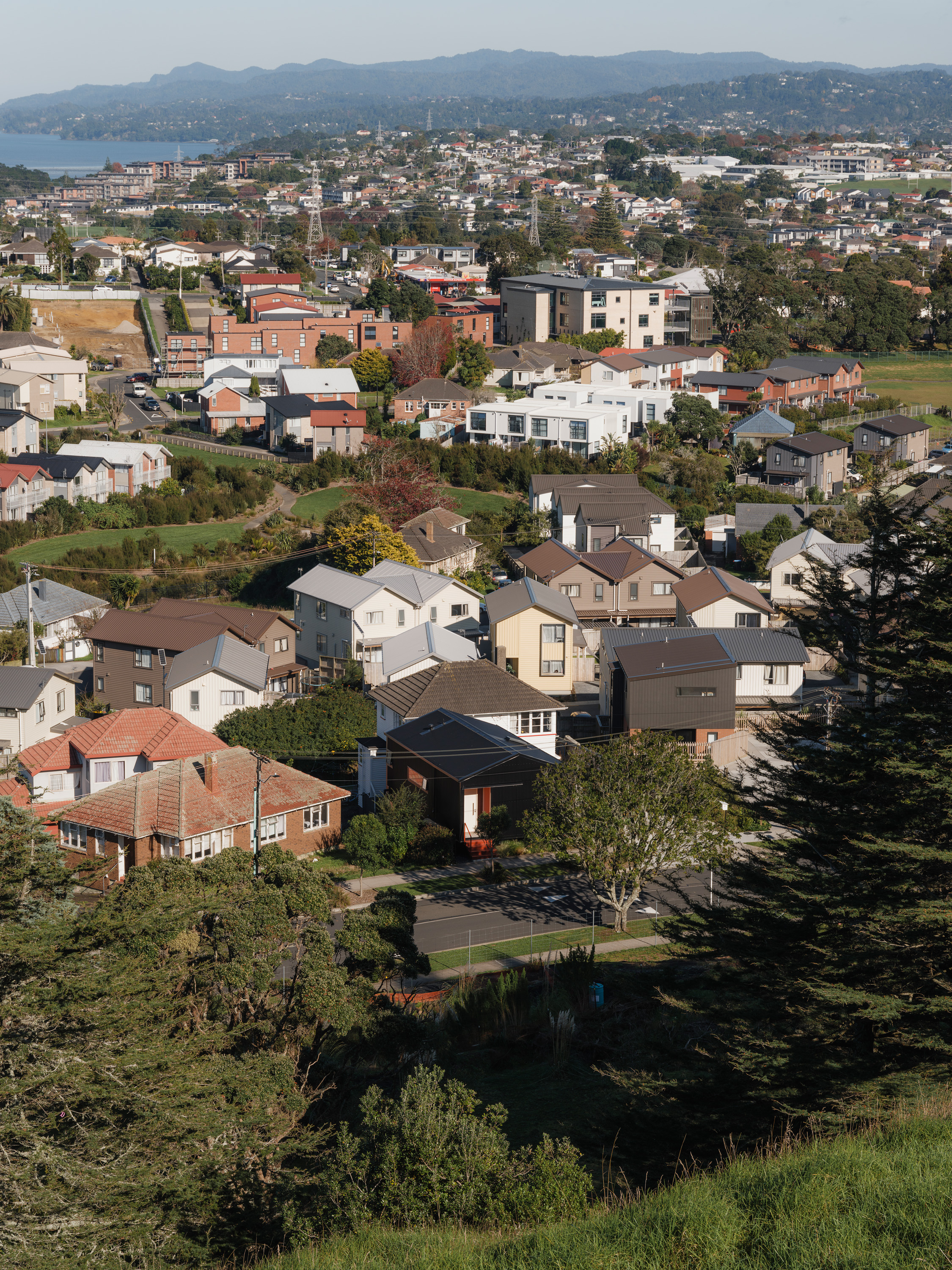
If you haven’t yet discovered GeoMaps on the Auckland Council website, you’re in for a treat. In the case of Roseman Avenue, on the slopes of Puketāpapa Mount Roskill, aerial photography shows the area’s transformation from rolling farmland to suburbia in the late 1940s and early 1950s. Then, in the 2020s, you see the collision of two massive changes in the suburbs of Tāmaki Makaurau: the wholesale rezoning of neighbourhoods for more density under the Auckland Unitary Plan, and Kāinga Ora’s redevelopment of low-density state housing. Roseman Avenue and the adjoining semicircle of Kallu Crescent transform at the click of a button. Houses appear then disappear, and then eventually new ones spring up.
But one thing stays the same: a two-storey 1950s weatherboard house that architectural designer Wade Southgate and his sister purchased with their respective partners in 2020. Together, they flatted in the old house and did it up – removing a couple of walls downstairs to open up the living area, replacing the kitchen and redoing the bathroom. They learned practical skills, such as plastering. Southgate even became a qualified waterproofer, but credits wife Stefanie Brett, a teacher, with undertaking the majority of the tiling. “It was Covid,” he says, “so as much as anything it was because we didn’t have a lot to do.”
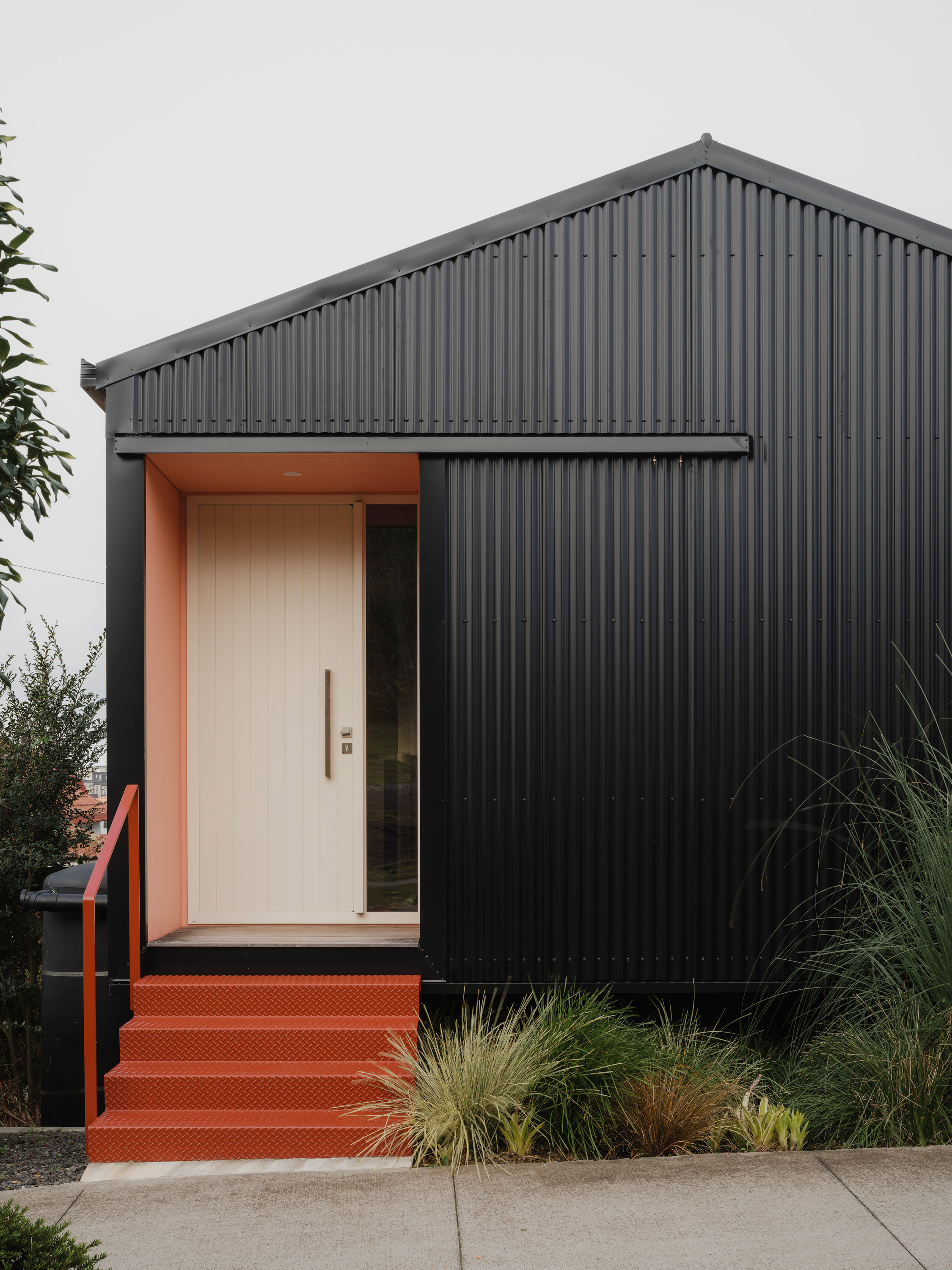
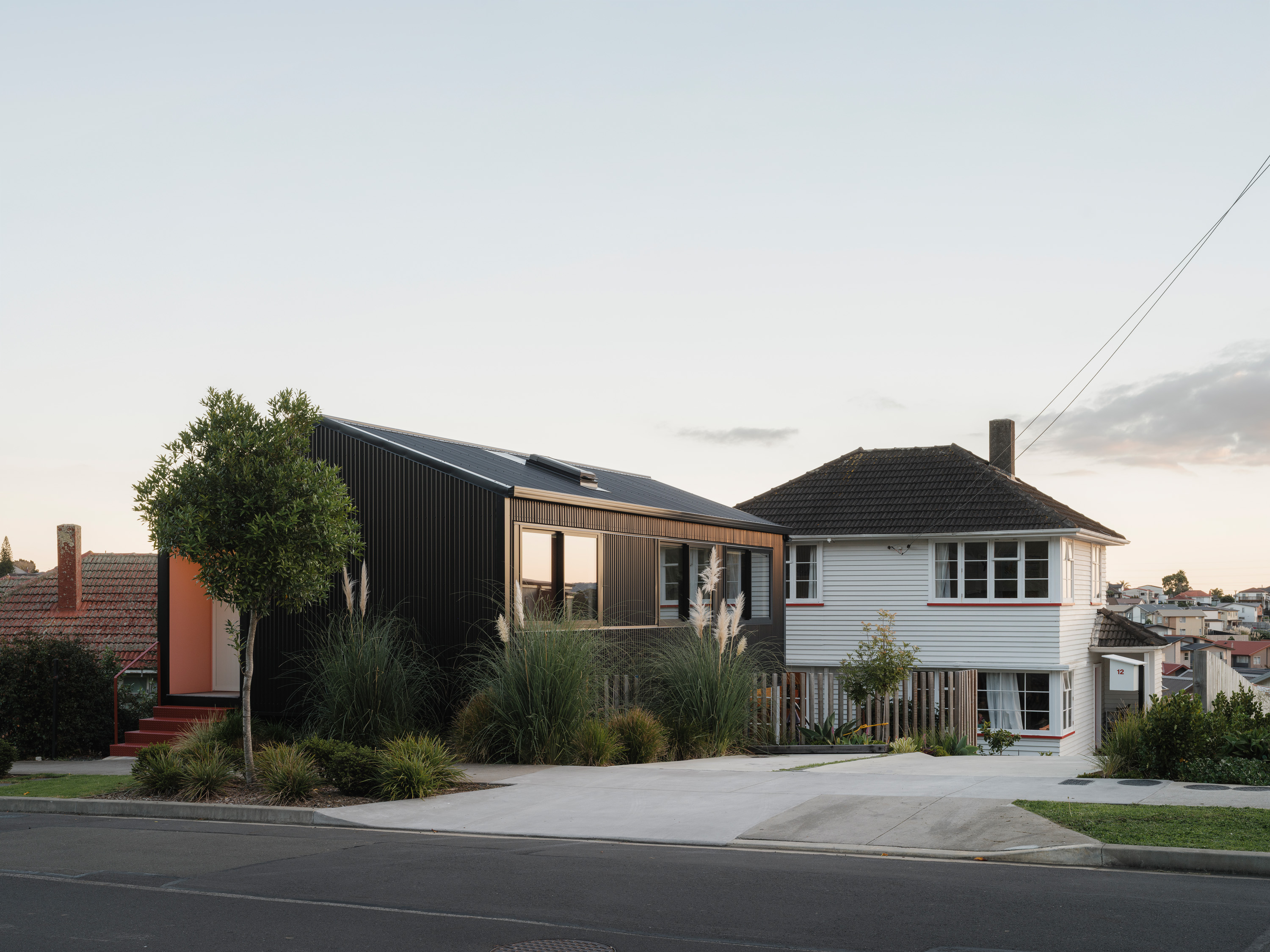
All of this was something of a dummy run for the next stage, in which Southgate took advantage of those zoning rules. The 792-square-metre site, previously home to one modest house, could comfortably accommodate three. So, as a combination of state and private developers rebuilt the neighbourhood around them, Southgate showed a softer approach, designing a new, two-storey house that sits right on the street, perpendicular to the original home. “We wanted it to look like a single-level house from the street,” says Wade, whose design excavated the previously sloping front yard to accommodate a lower living level. “It looks like one volume, and then the living space is tucked away. I think most people thought we were just building a big garage.”
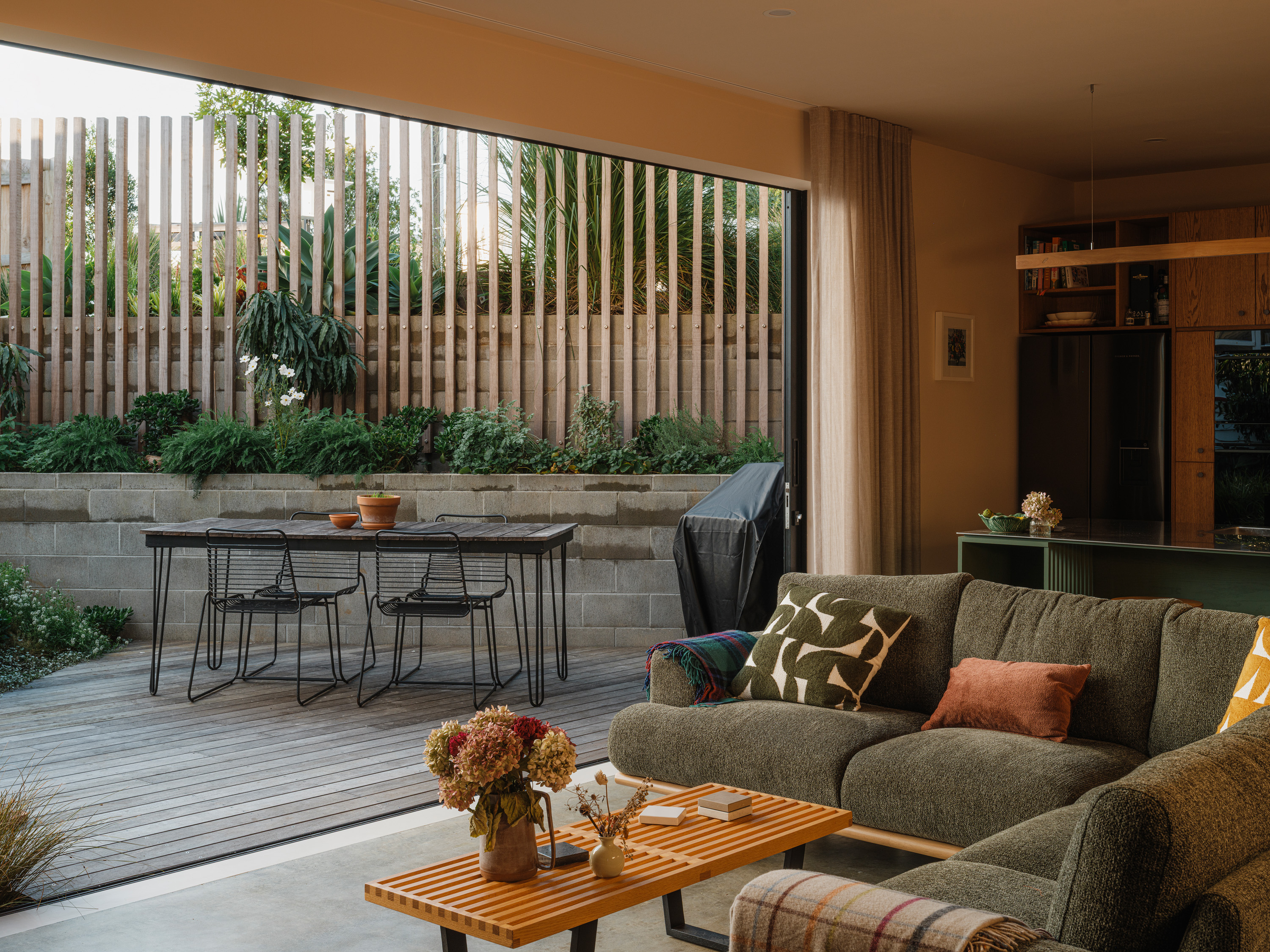
The approach preserves the street appeal of the original state house, now repainted and generally refreshed, and it creates small, but separate, outdoor living spaces. Since all the occupants are family, there are no boundary fences, no demarcations, yet their primary living spaces and outdoor areas are nicely private. “If we’d done it another way, we would have just been staring at each other the whole time,” says Southgate. “This gives us privacy – and the idea is that the garden is shared between us.”
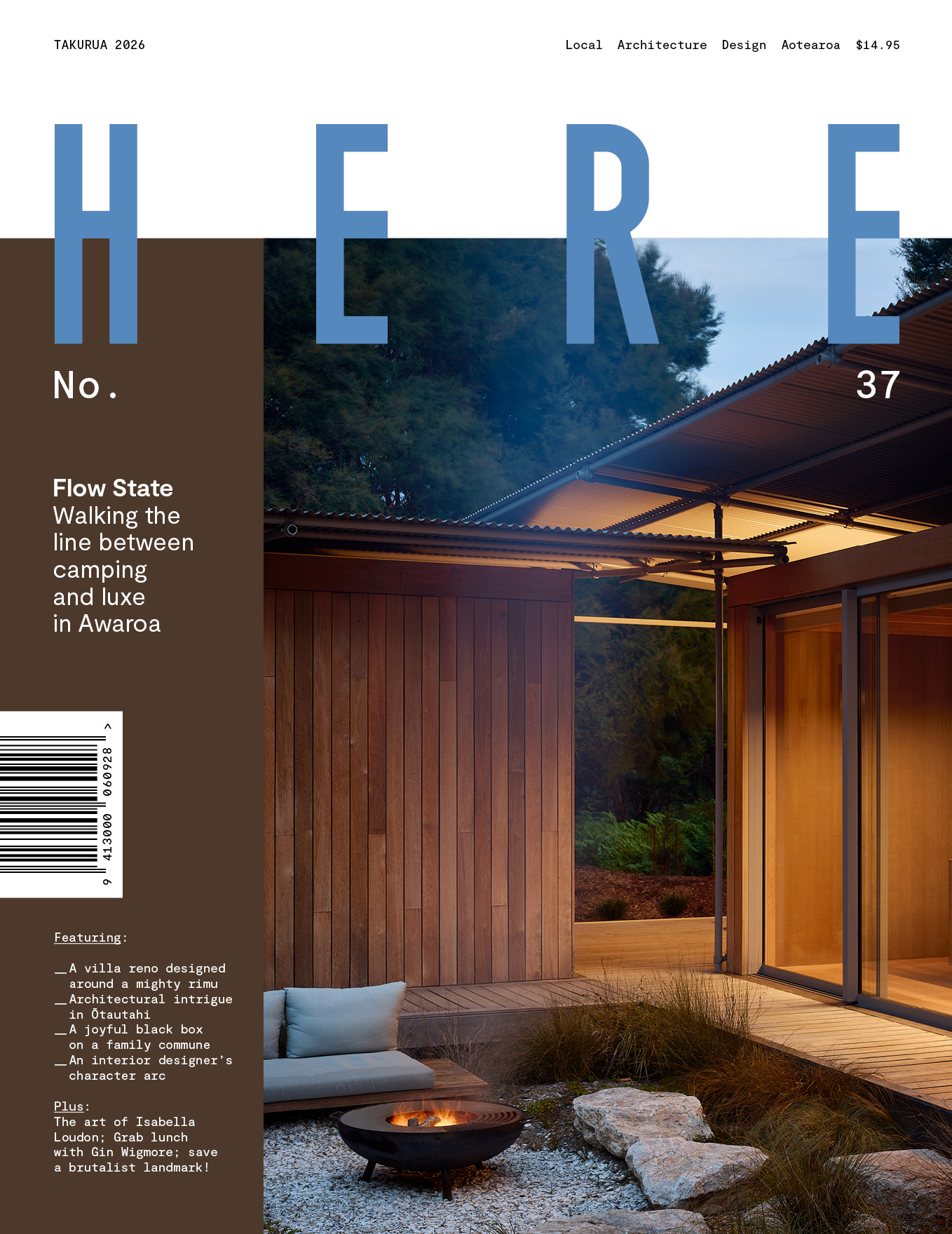
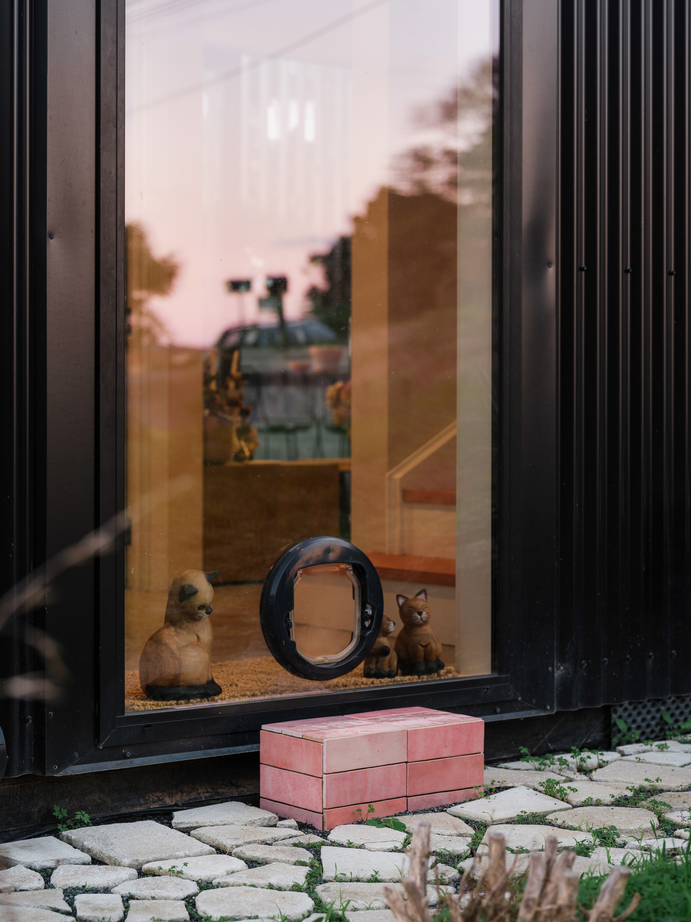
As Southgate notes, from the street the house reads as a single storey, clad in black corrugate with a wide gable. There’s a generous porch, painted pink, and three steel steps up from the footpath, powder coated red: the combination is jaunty, and it glows. “I was really into the idea of the stoop,” says Wade. “It’s a really safe neighbourhood and being so close to the street almost works the other way – people think they’re being watched.” There’s a small carpad too. A timber balustrade on the retaining wall acts as a screen for the living spaces below.
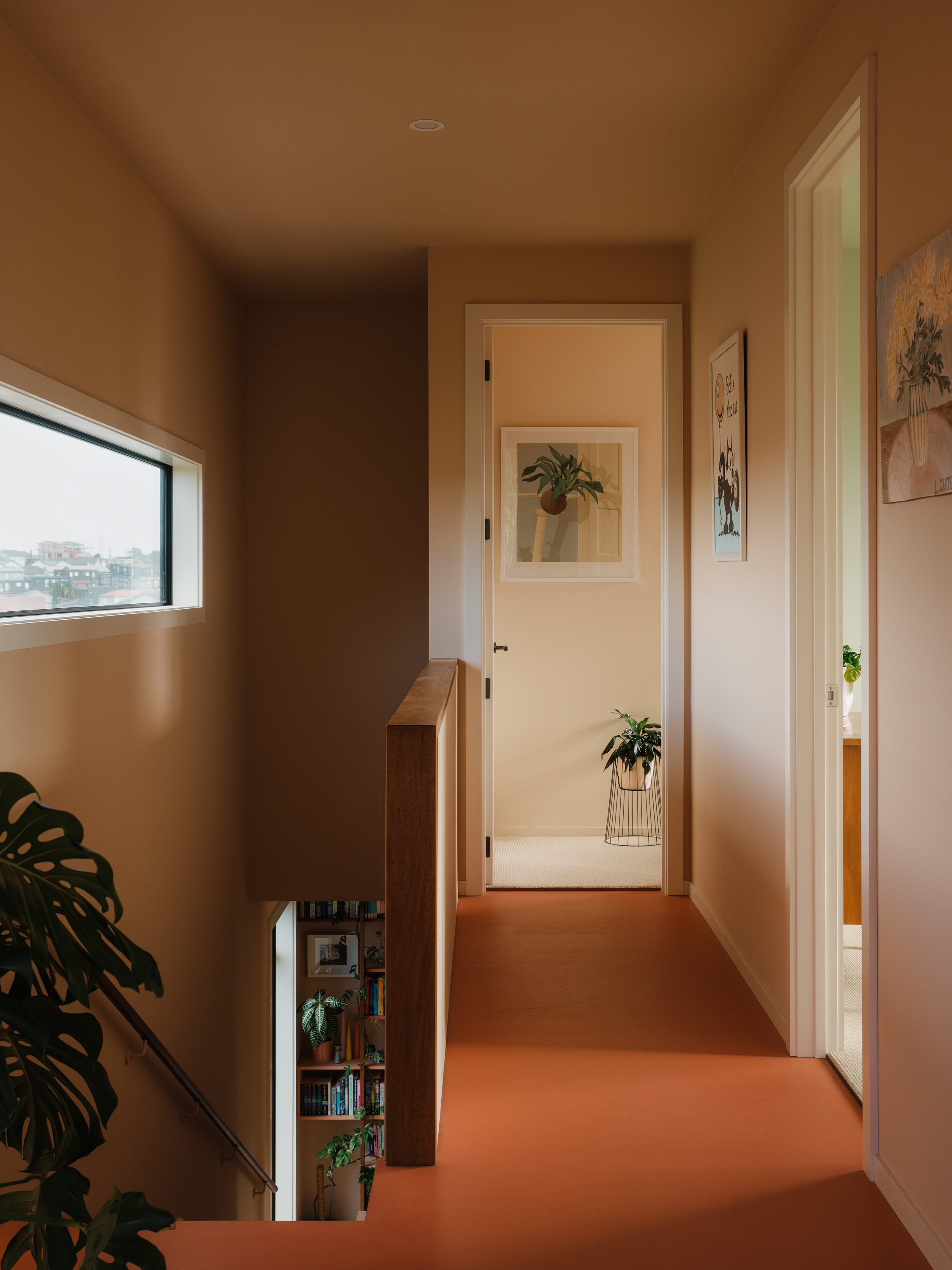
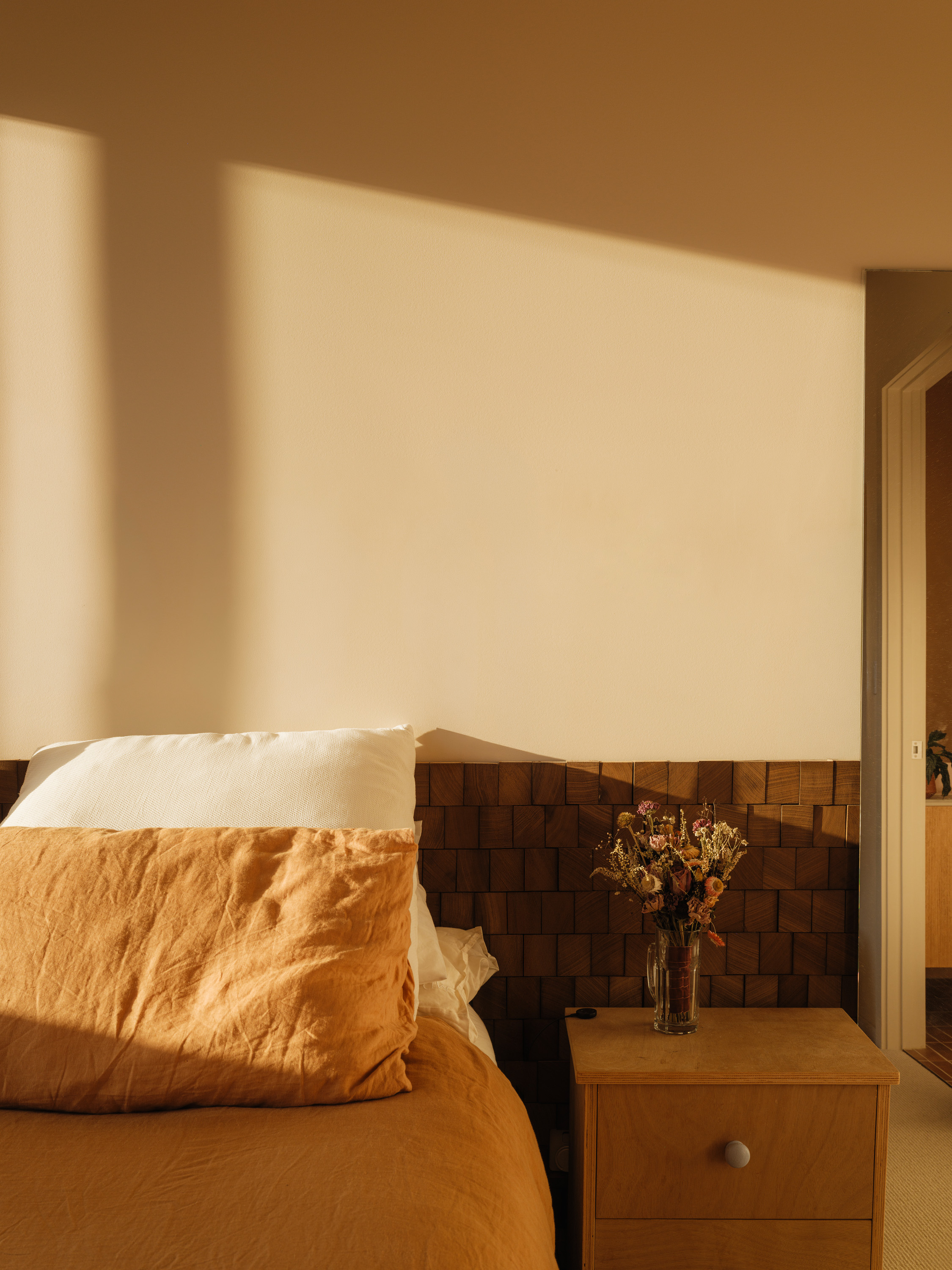
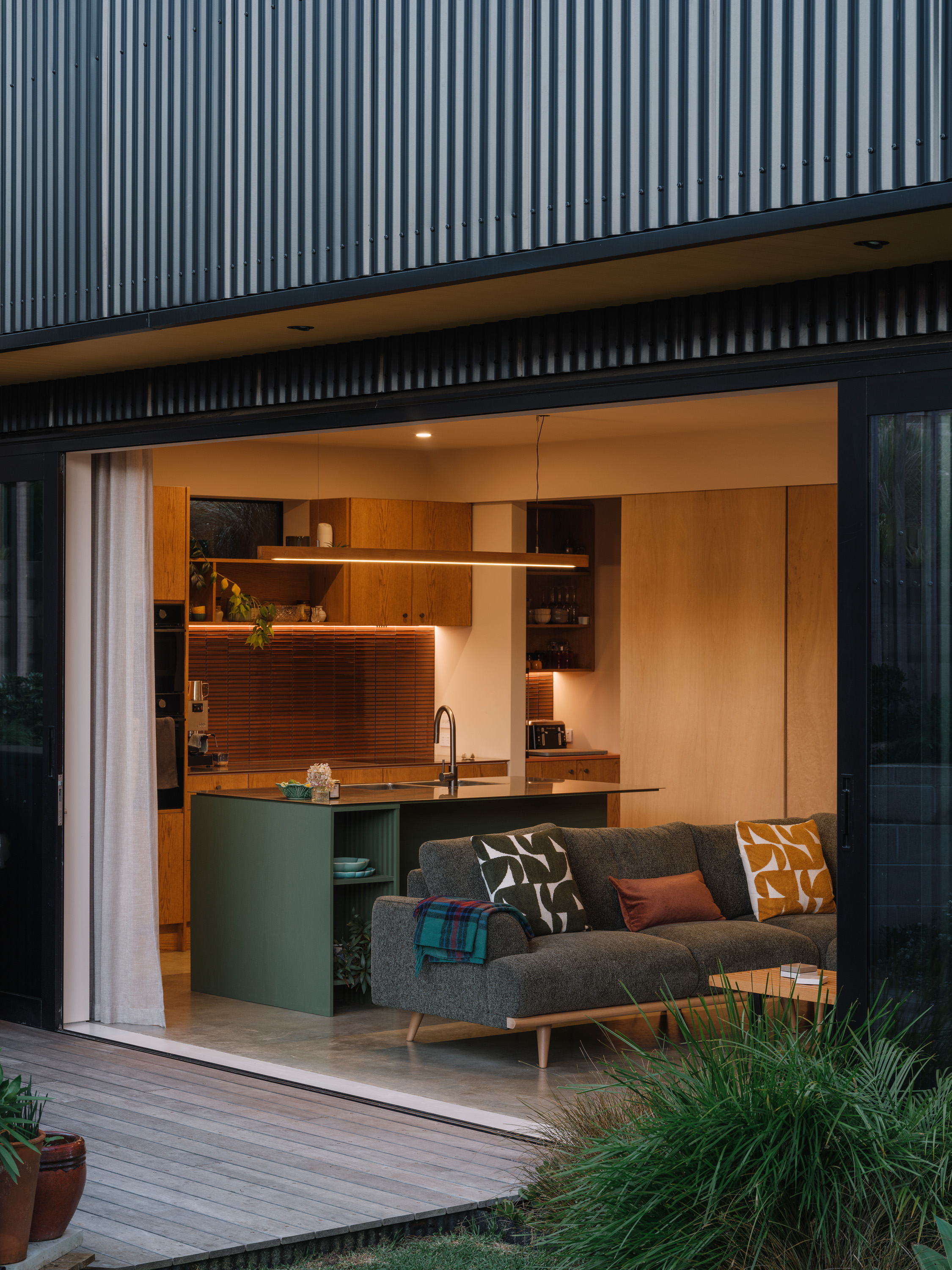
While the house looks tiny, inside the stud is a generous 2.7 metres instead of the standard 2.4: a small change, but a significant one. Generous, oversized windows in the bedrooms bring in the afternoon sun, and while you can see the new townhouses next door, trees on the boundary will eventually grow to screen them out. On the top level are two airy bedrooms, a bathroom and a main bedroom with ensuite. Downstairs: the same generous stud, a study, and an open-plan living space and kitchen with huge sliding doors that open to a north-facing courtyard. “We knew there was enough space for everything, even though it’s small,“ says Southgate. “The plan is actually very similar to what we did in the state house, once we’d taken out a few walls. And that worked really well for the four of us.”
He designed the house while working for Burgess, Treep & Knight Architects, where director Graeme Burgess technically signed the building drawings off for council, and finished it as he started working at Sunday Architects, with Samantha Zondag. Together, Southgate and Zondag are interested in making buildings with strong design intent, but not necessarily a lot of inbuilt cost. At Roseman Avenue, the builders left Southgate and his cohort with something of an empty shell, and they fitted out the rest of it during weekends, evenings and school holidays. They plastered and painted, waterproofed and tiled, and built cabinetry cut to their design by Cutshop, a CNC-routing company. In all, they saved more than $100,000 on the already economical build.
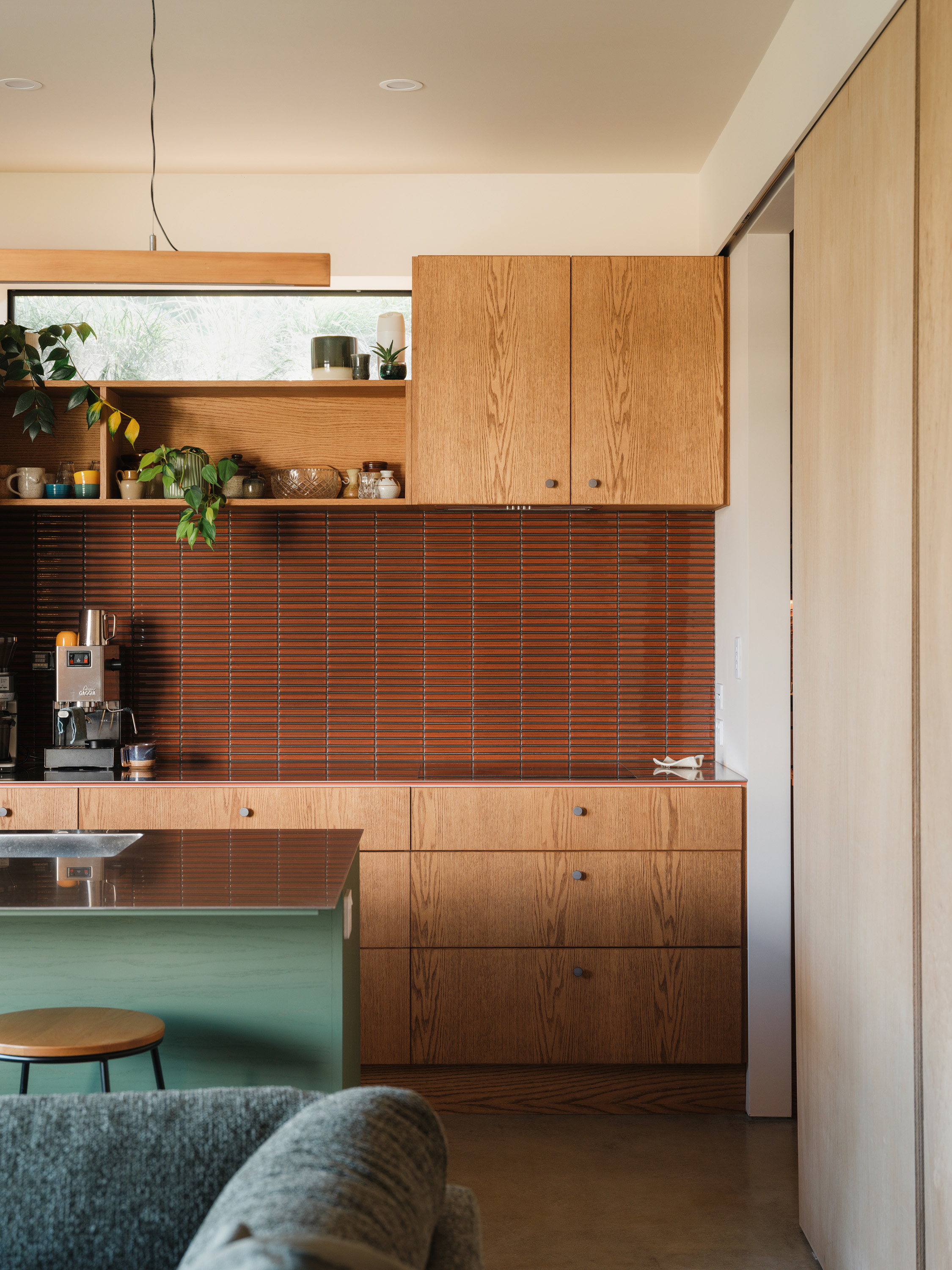
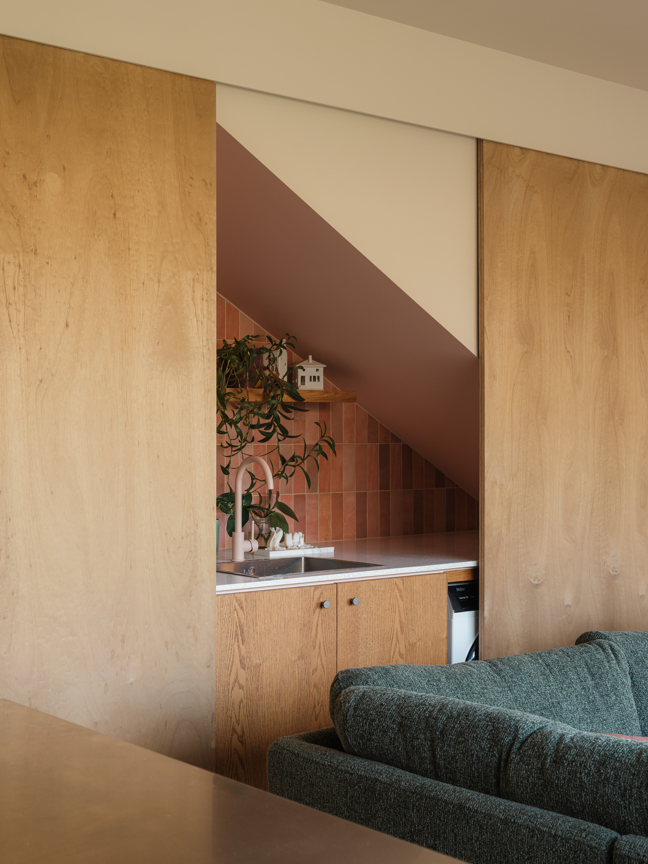
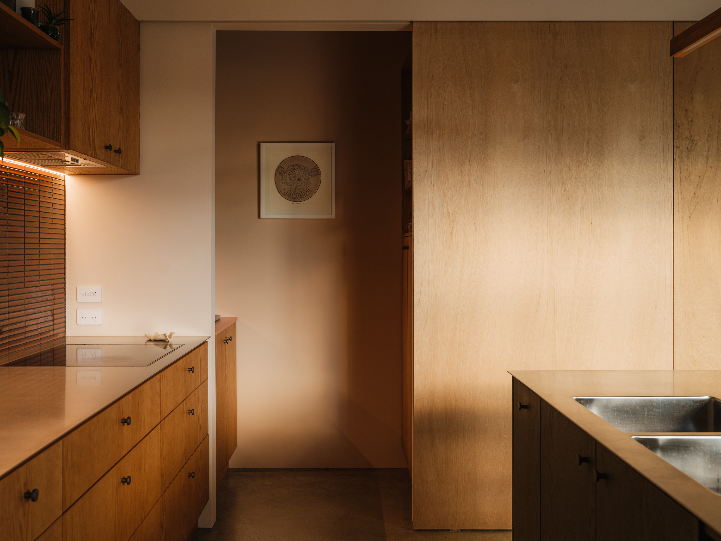
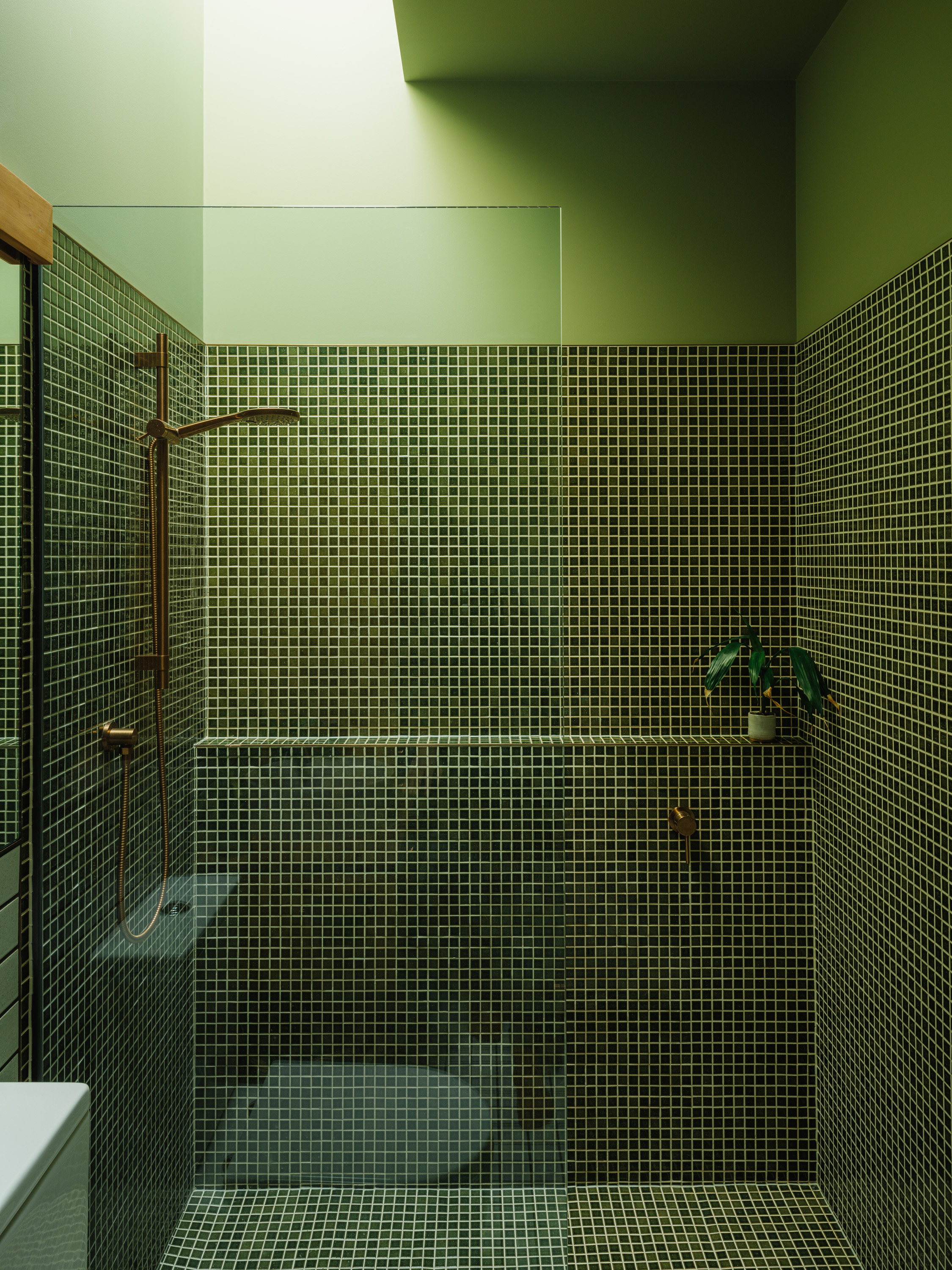
For that reason, the house was designed specifically to the skills of its owners and their collaborators. “I really liked designing with that in mind, because there’s a threshold you don’t want to go past, where it becomes too hard,” says Southgate. “So you’re always asking, ‘How can I simplify this but still keep the aesthetic? Where should I stop?’” That doesn’t mean there aren’t nice details: far from it. The main bathroom has a tall skylight above the shower which drags light into the otherwise windowless space. Big sliders in the living room pull back to reveal a tiled laundry where the countertop doubles as a bar for parties. There’s lots of cabinetry, and a pint-sized scullery. “Designing this way has to be more considered because there’s less room for fluff,” he says. “I use that as a starting point for everything, and if you have the luxury to expand later, then great.”
Best of all, in the kitchen, there’s a small, high window at street level. “I was a little worried about how much morning light we’d get down here,” says Wade. “I knew we would get plenty in the afternoon, but first thing in the morning, you get a little glimpse as it comes up over the maunga.” The window is just enough for the sun to shine through, and it gives them a lovely little connection to the street.
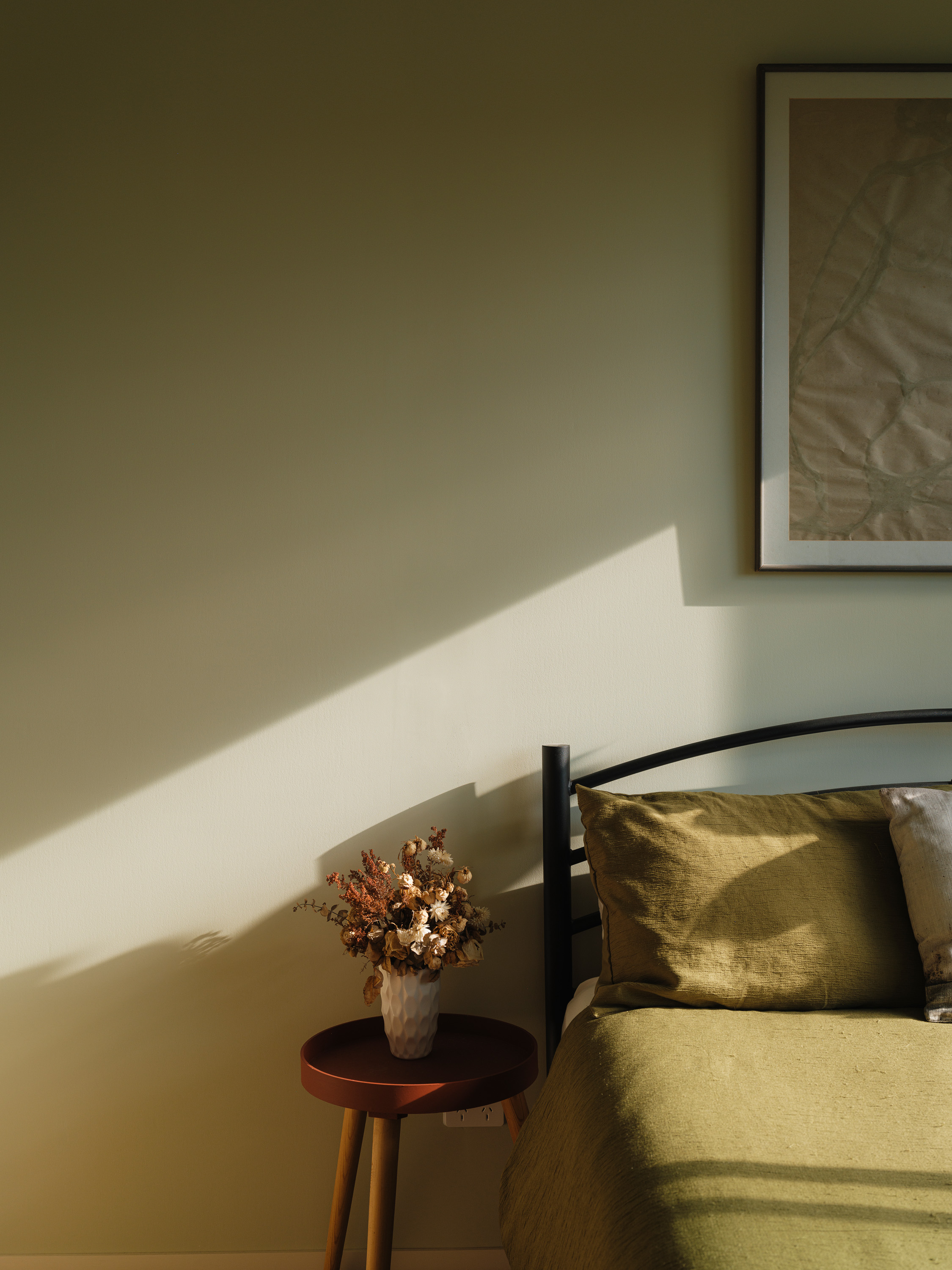
And the colours? Those are down to Brett. The floor upstairs is ply, painted a rose pink; walls throughout are a gentle apricot. There’s a green bathroom and a deep-red study. They were both on board with the idea of different rooms being different colours. “We wanted to have fun with it,” says Southgate. “She had the colour palette, and then together we worked through which colours would work best spatially as you move through the home.”
The house was finished last year, and they finally moved in. Southgate’s sister recently had a baby, the first grandchild of the family. For that last slice of the section behind the original house, Wade is designing a third dwelling, this one for his parents, who are downsizing from their family home. It’ll share some details with his and Brett’s house, though it’ll be on one level. The site will become a proper family commune, with a shared garden – and three houses where there used to be one.
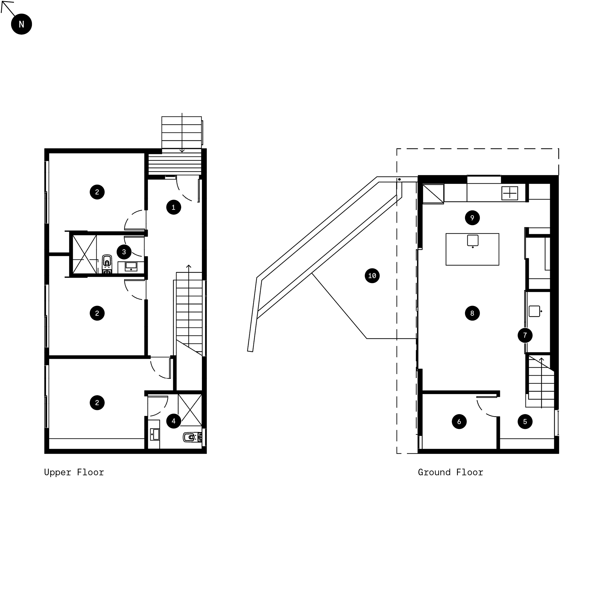
1. Entry
2. Bedroom
3. Bathroom
4. Ensuite
5. Library/Landing
6. Study
7. Laundry
8. Living
9. Kitchen
10. Deck/Courtyard