This home sits in an interesting pocket of Ōtautahi Christchurch, perched on the fringe of its upmarket suburb. The area is a bit scrappier than the posh parts of Merivale, the street a collage of 2000s townhouses, tight multi-unit builds, and the occasional character cottage. Most give everything away. So when construction began on this four-bedroom home by Warren and Mahoney principal Tobin Smith, its guarded façade drew some attention.
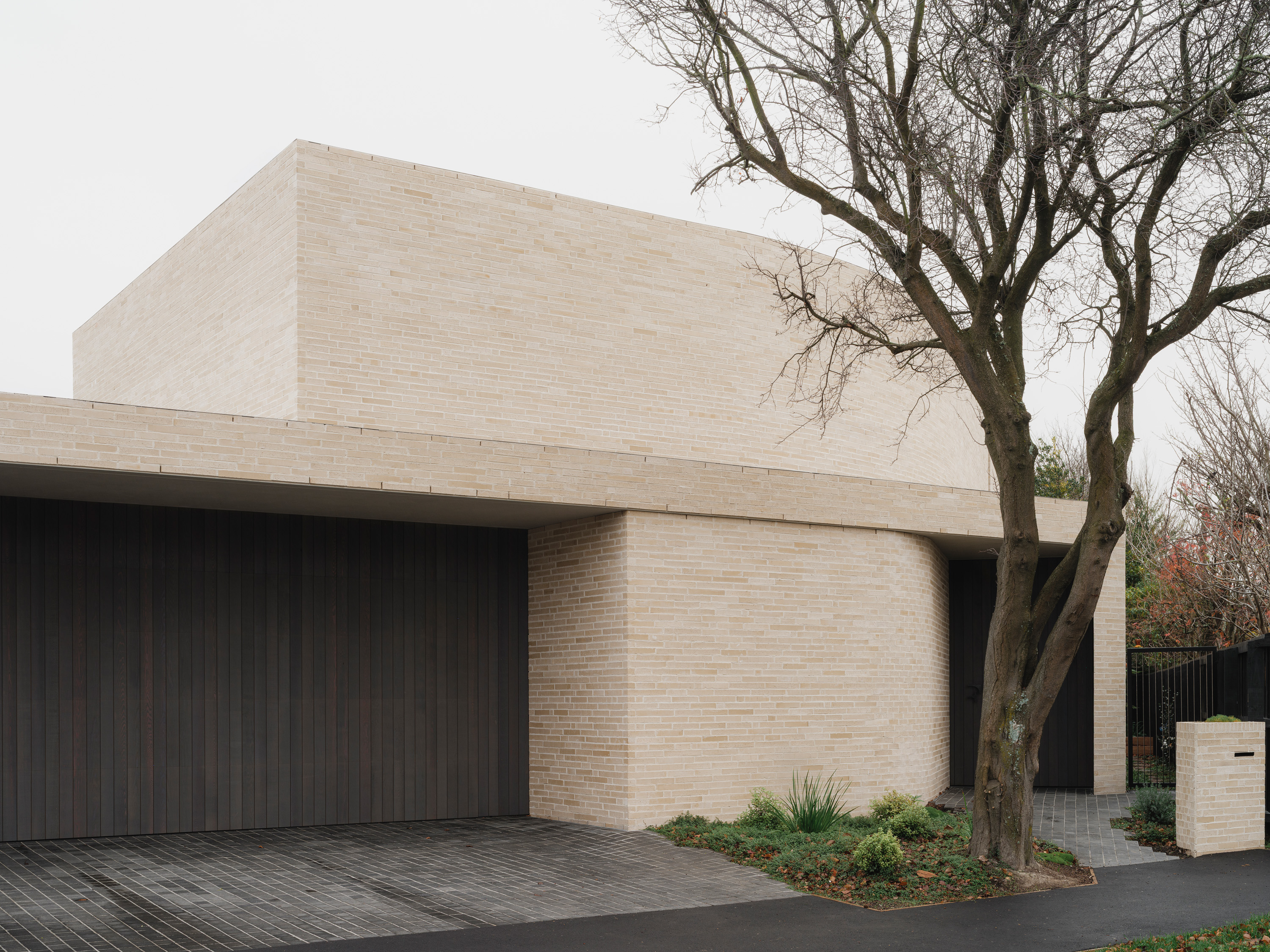
There was initial relief among the neighbours when they discovered the home’s earthquake-damaged predecessor wasn’t being replaced by another multi-residential block. Then came the questions. Hugging tight to the southern and eastern boundaries, punctured by a solitary street-facing window, the oatmeal brick form introduced a new level of architectural rigour to the street. It had presence, but was mighty secretive. Even with the front door or garage wide open, the house gives nothing away. “I’ve never liked the idea of exposing your whole living environment to the street,” says Smith. “We often play that game on a hill – holding back the view until you’re invited in. So there’s no reason an urban setting can’t have the same sense of drama.”
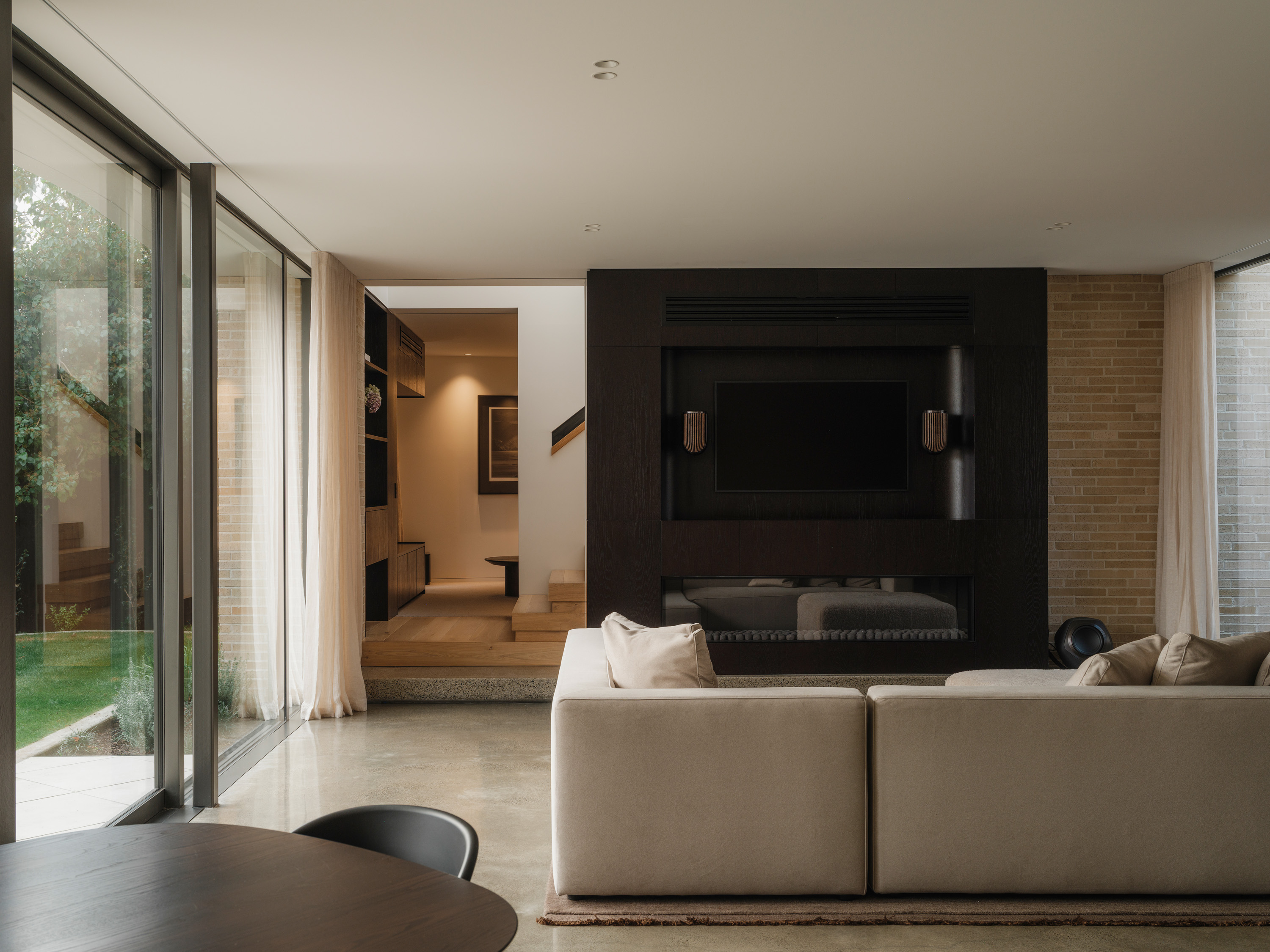
The entry is compact, but deliberate. Passing over basalt cobblestones and through the dark, cedar-lined entrance, you turn a corner to volume and light – the drama. Pushing the house hard against those boundaries created a north-western backyard that became the project’s centre of gravity. The dining and living areas, kitchen and bedrooms all overlook the private outdoor space. “It’s a bit of a wolf in sheep’s clothing. It doesn’t feel big from the street, but you come in, and it reveals itself,” says the architect.
What you see today is the second evolution of the project. The clients, a young professional couple, wanted to design a home for a future family. They had no children yet, just plans, and a beloved dog named Frankie (note the F-shaped front-door handle). By the time the build was complete, the house had caught up with them: one child in tow and another on the way. “The first plan was simpler and responded to the clients’ budget at the time. But to their credit – and this never happens – they decided to put a bit more into it and take the home to the next level,” says Smith. While the core of the design held, other elements were elevated, its square corners softened, and there was a material shift to this warm brick.
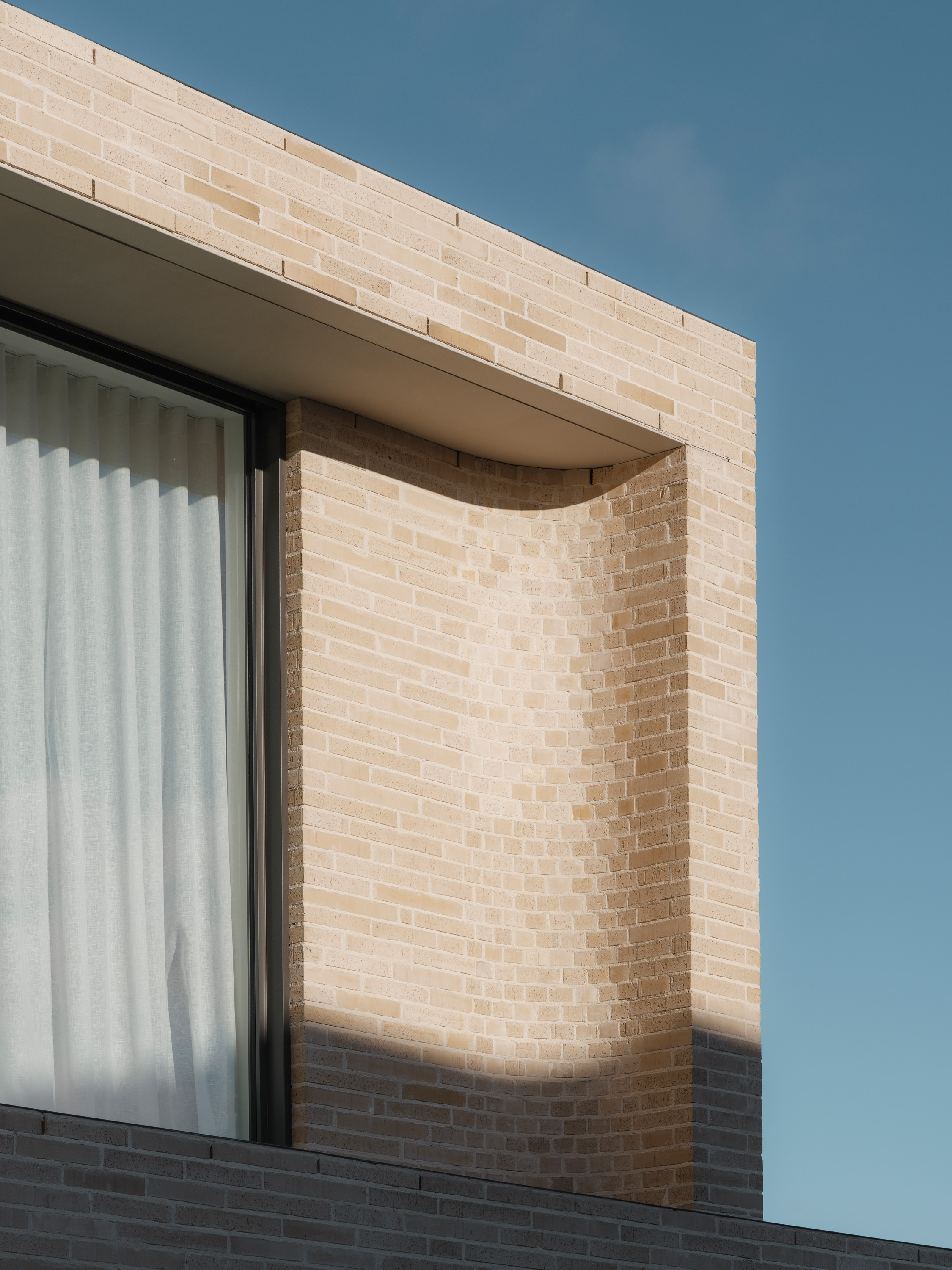
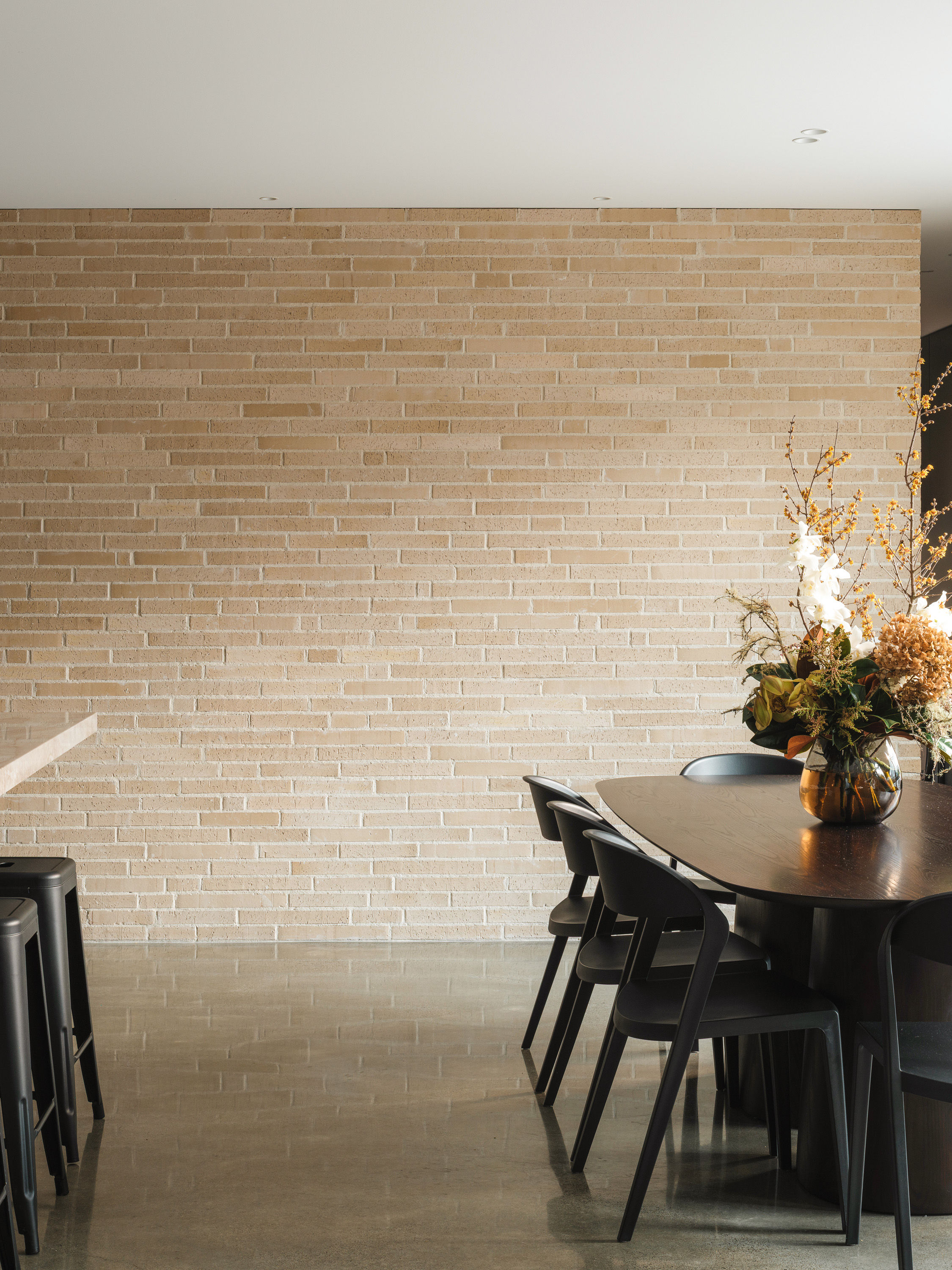
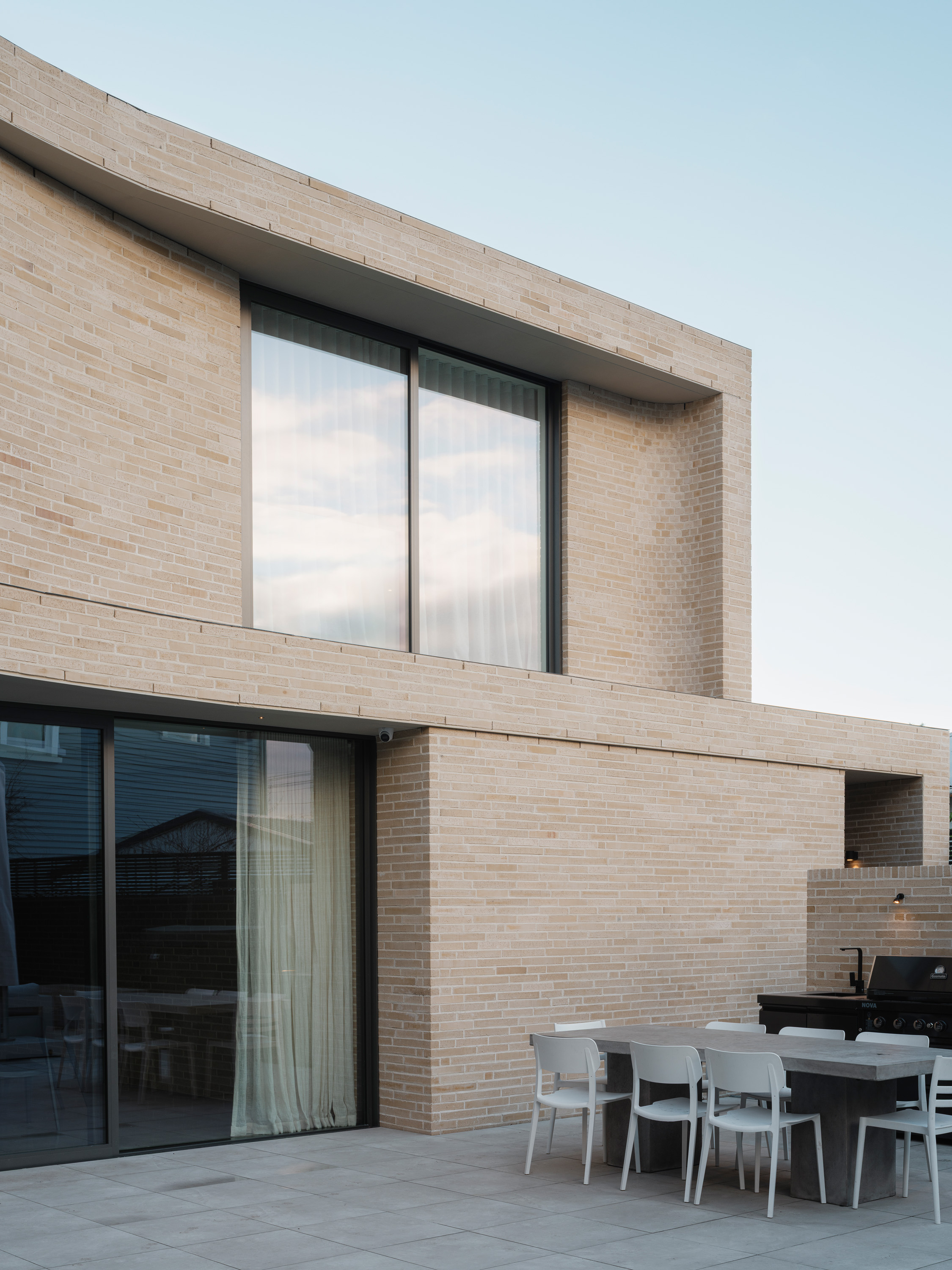
The architect and clients worked with Canterbury Clay Bricks, exploring different brown and neutral options before mixing South Island clays and landing on this custom tone. “We ordered two different sizes – a long brick and a shorter one – and had them arranged in a really random lay, showing all faces of the brick and using the offcuts too,” Smith explains. The result is a genuine, organic variation of texture and tone that gives the slick form a bit of grit. It also meant that there was almost no material waste in the process.
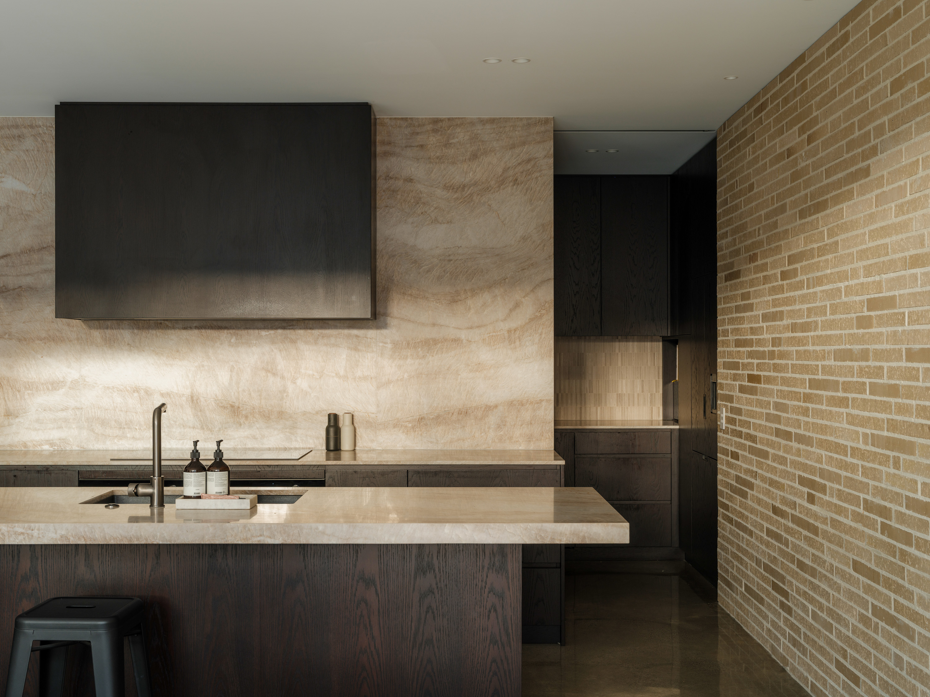
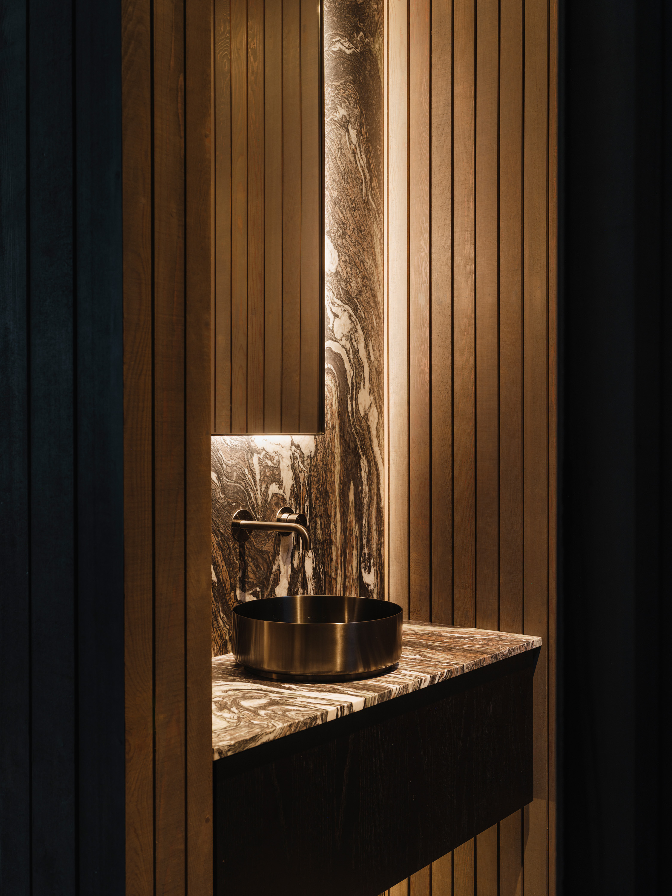
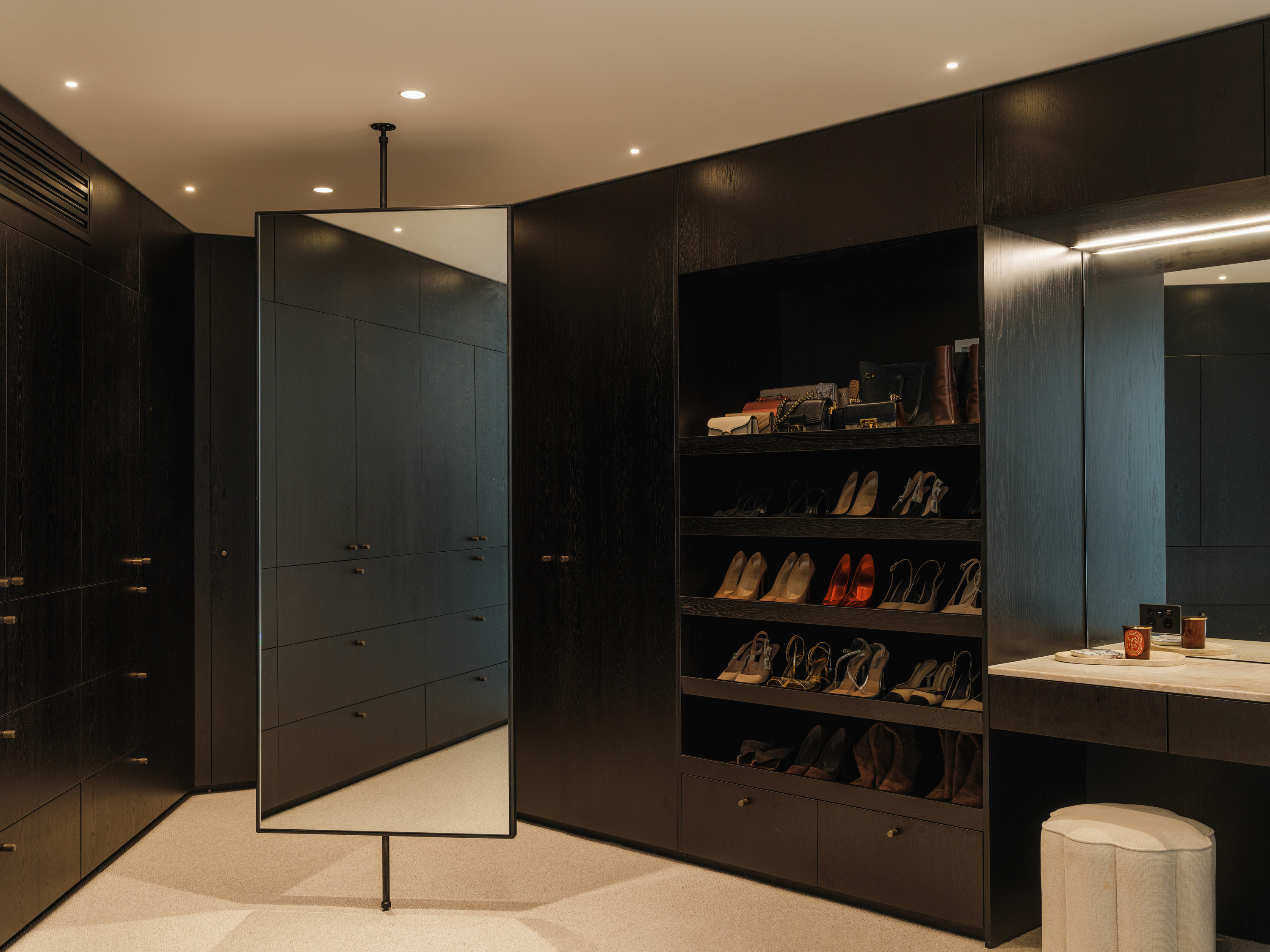
To plant the home into the site, the cladding dips below ground level in an exaggerated rebate, so there’s no visible foundation line. The brick walls travel inside too, meeting polished concrete floors, soft textiles and dark oak joinery. It all plays neatly into the clients’ brief for “soft but masculine” interiors. “The other thing we were conscious of was making sure that the house was set up, yes, for children, but also for entertaining,” says Smith.
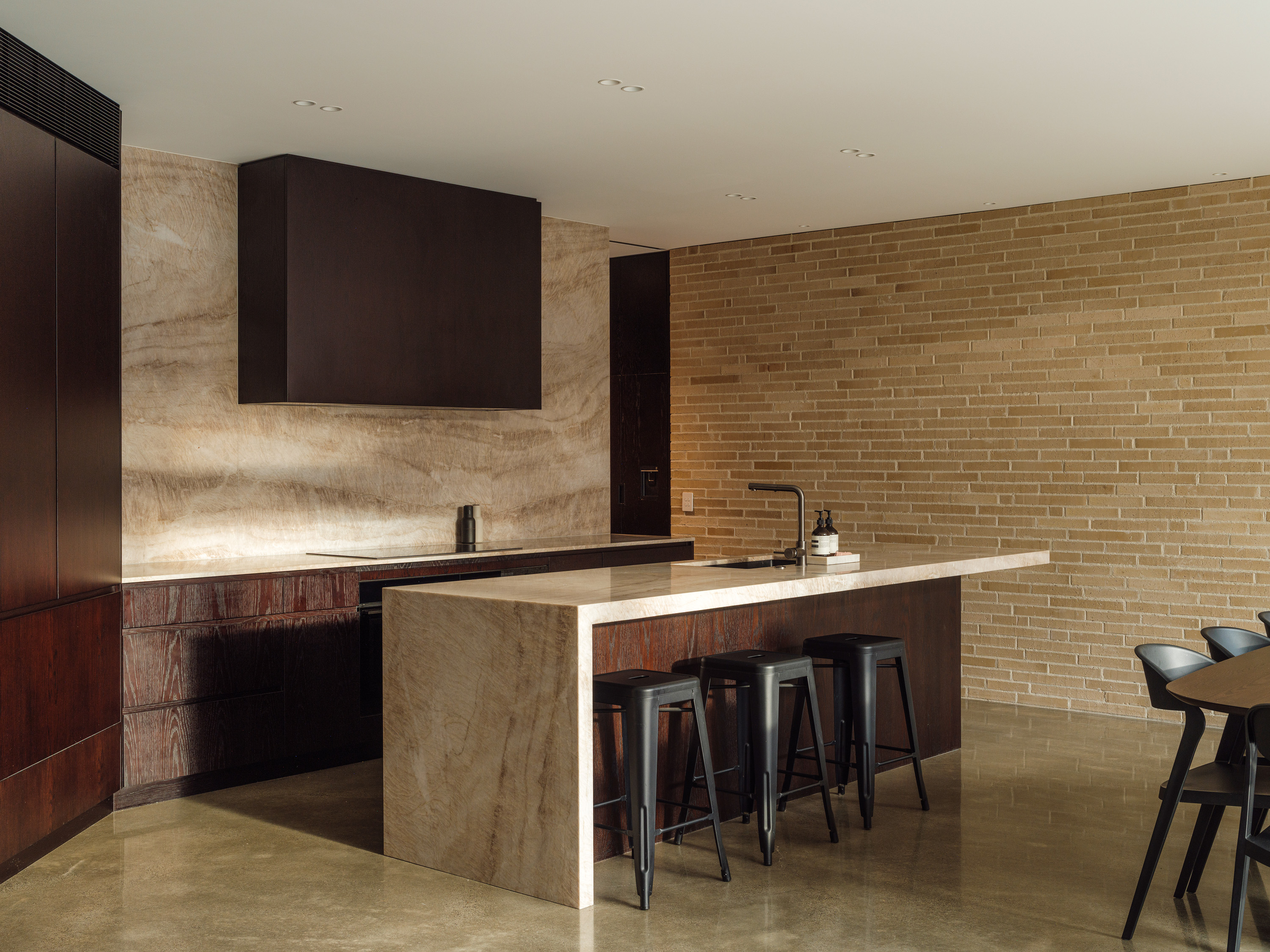
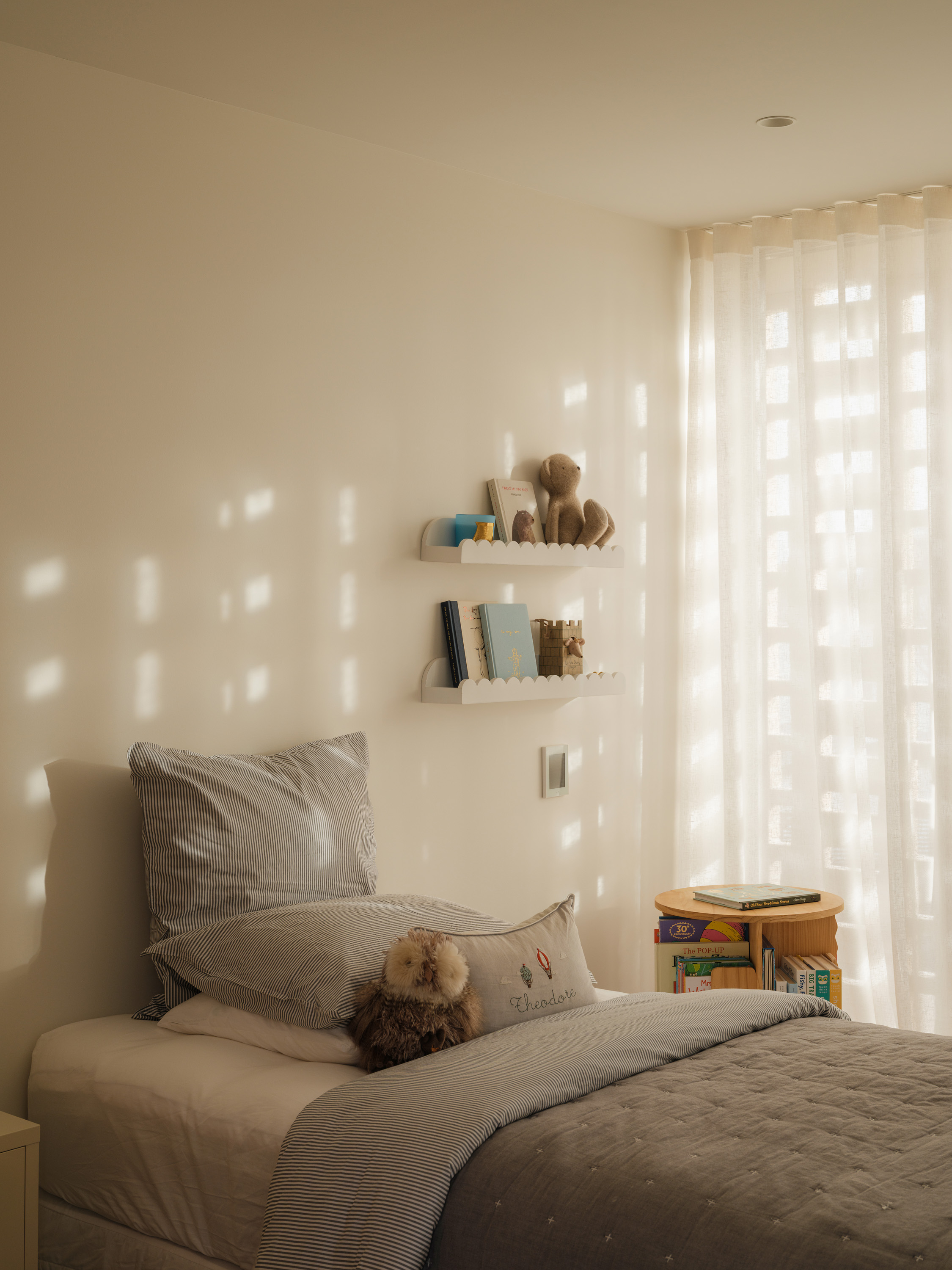
The stairwell placement was key to unlocking that duality. It was originally drawn at the back of the house, but the architect realised that might stunt circulation, so repositioned it as the junction between public and private spaces. It provides a buffer between the entertaining zones and the bedrooms, with a guest suite tucked to one side of the stairs on the ground floor, and the three family bedrooms on the level above. Pocket doors add another layer of noise control, so the kids can be tucked up in bed while the adults party on below.
At the top of the stairs, a breezeway splits the plan. On one side are mirrored children’s rooms; on the other, the primary suite. A narrow deck connects the kids’ rooms, screened by a latticework brick veil. It tempers the sun, filters views and elegantly eliminates the usual terror associated with small children and balconies. As a design move, it’s lovely; as a sneaky route for kids to tear between each other’s bedrooms, even better.
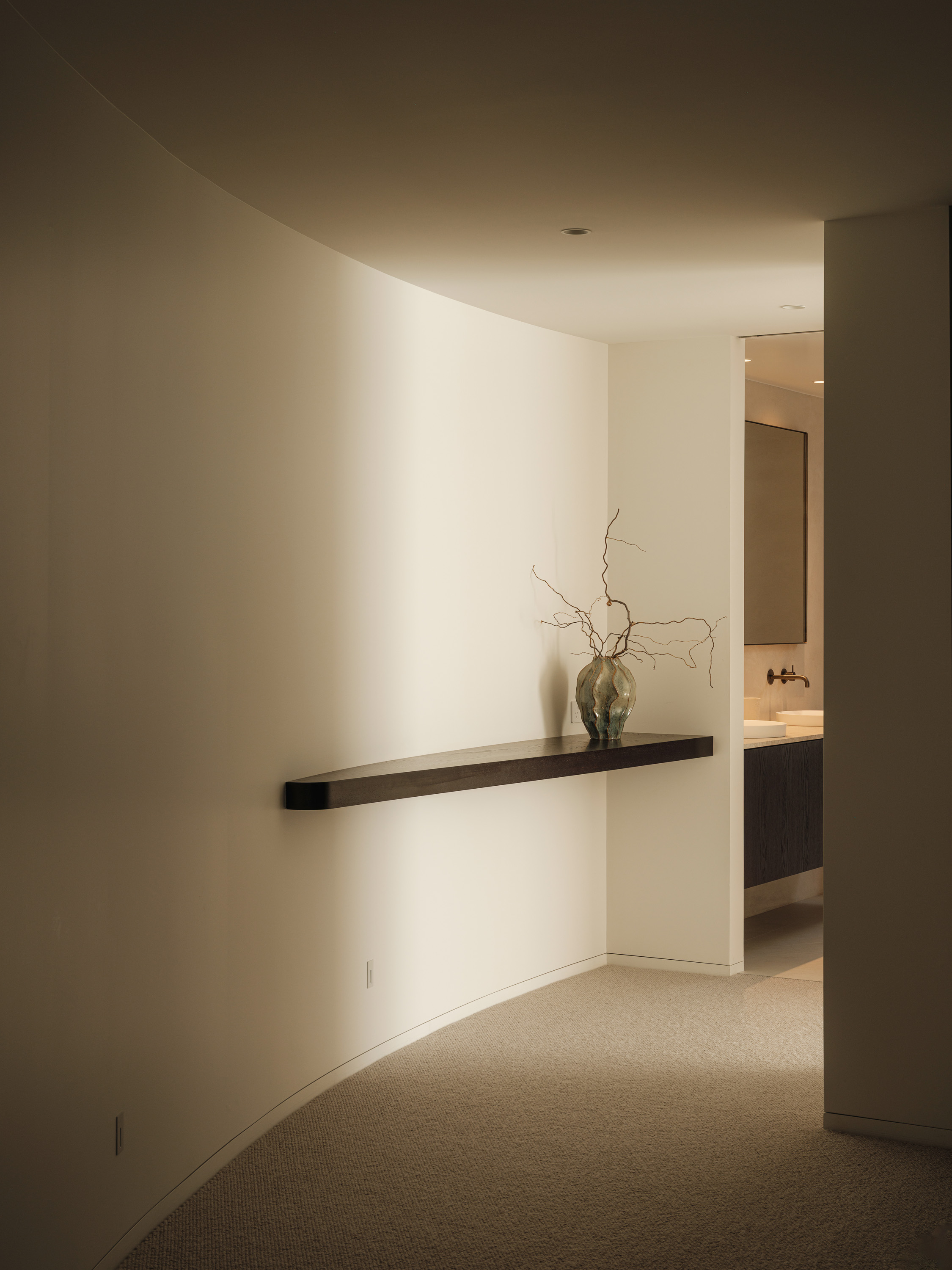
In contrast, the primary suite is all about retreat. The generous robe, ensuite and bedroom open over a glazed edge to the courtyard below. A 40-degree crank in the floorplan sets the house on a curve, bending views back towards itself, and you notice that the two offset levels only fleetingly align, sitting slightly askew rather than stacked. Impressively, in this dense urban setting, only one neighbouring window looks in on the house. But it’s small, rarely used and already softened by planting. In return, the home doesn’t overlook others; the focus remains firmly internal.
Even the sole, street-facing window (at the top of the stairs) is angled towards the neighbour’s garden. It’s a pretty vignette, but its role is as much about ventilation as light. “I’ve always admired Japanese infill houses; they’re such beautiful objects, but have very little glazing to the street,” says Smith. “I think with a monolithic building like this, you want it to anchor as heavy and solid as possible to the site, and every window takes away from that. Instead, we drew light from above.”
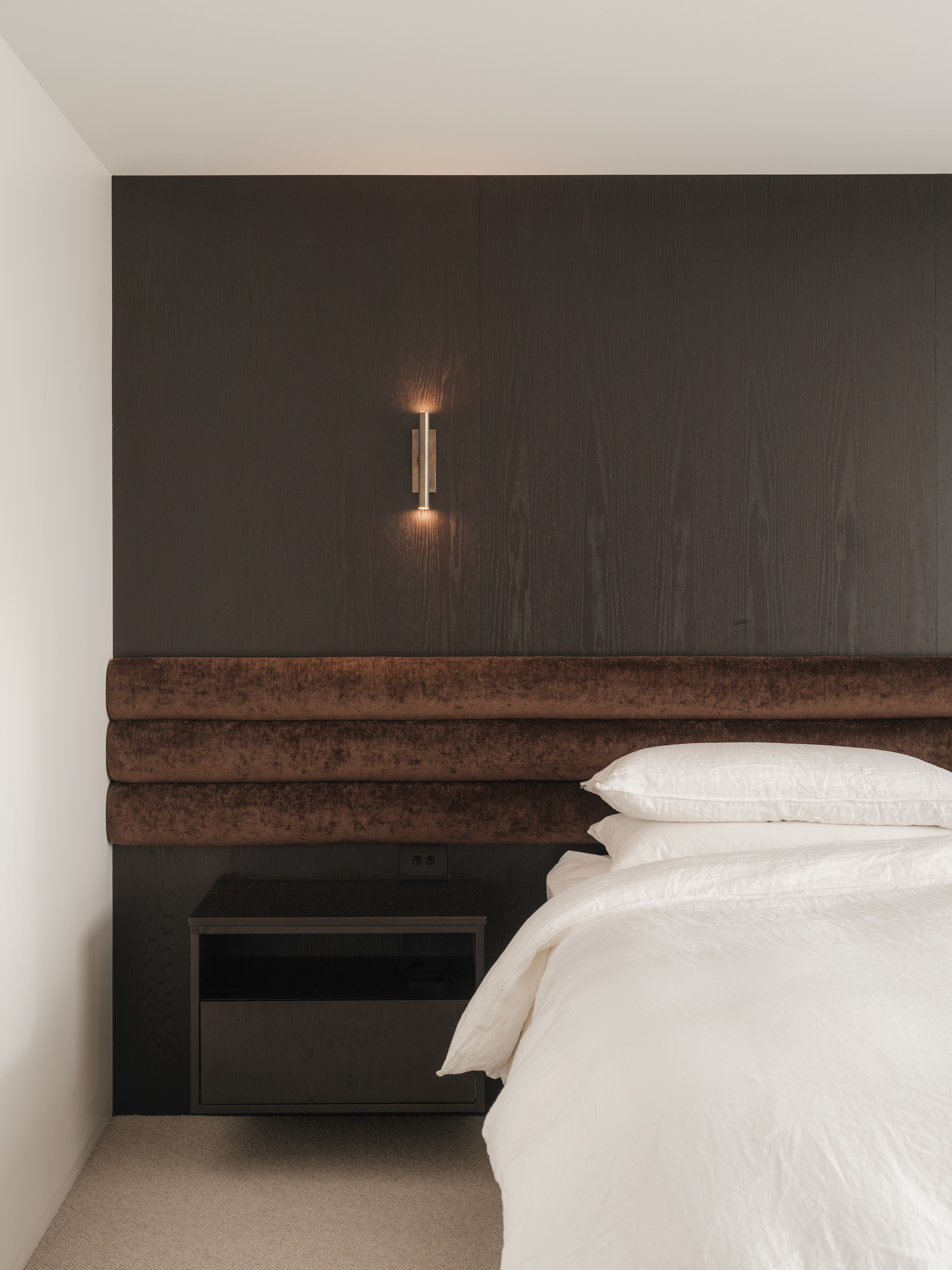
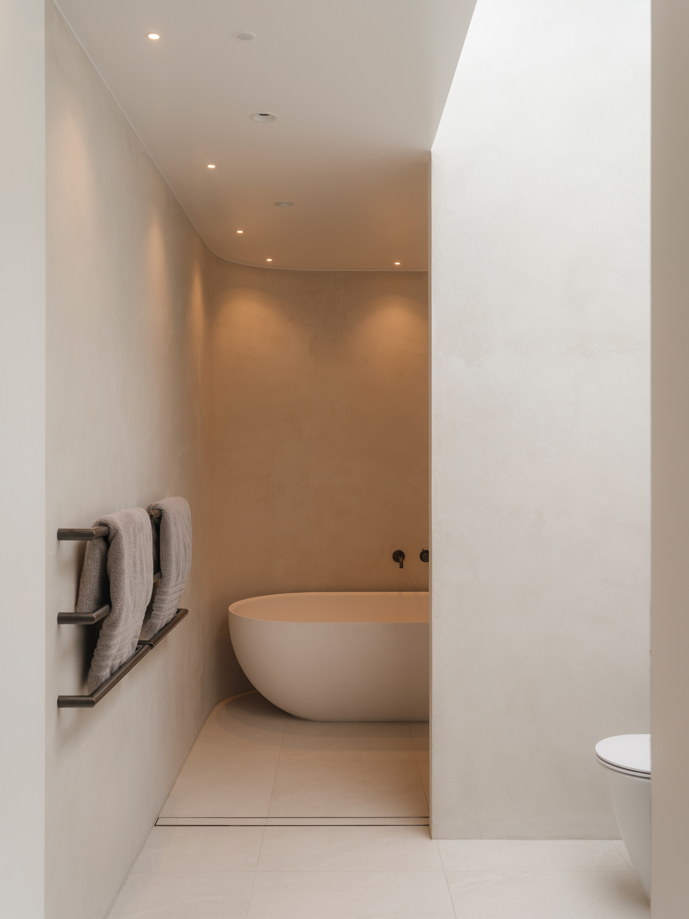
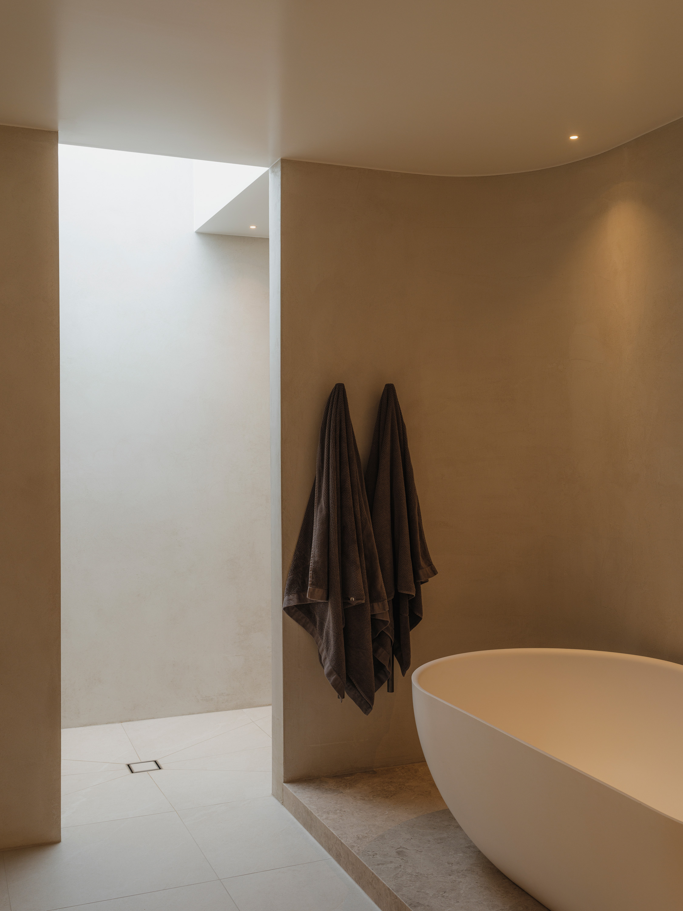
Long skylights pull the sun in and let air out. They’re placed with intent, set on a sensor to open or close in tune with the weather. The stairwell is flooded with light from above; the family bathroom vanity is washed in daylight while the bath recedes into shadow; and in the primary ensuite, you can shower under the stars. “Actually, these bathrooms were an interesting one,” Smith points out. “Because of the layout and the build schedule, the baths were actually popped into place before the roof even went on.”
At just under 350 square metres, it’s a substantial house for a tight urban site, but one that has been rigorously designed. Nothing is wasted, and the planning is closer to that of a townhouse than a typical family home. Spaces bleed into each other rather than relying on corridors; the only real circulation space is that breezeway between the bedrooms. The result is a house that performs a quiet sleight of hand. From the street, it intrigues and withholds. Inside, it expands into an intimately personal home shaped around friends, Frankie and a growing family.
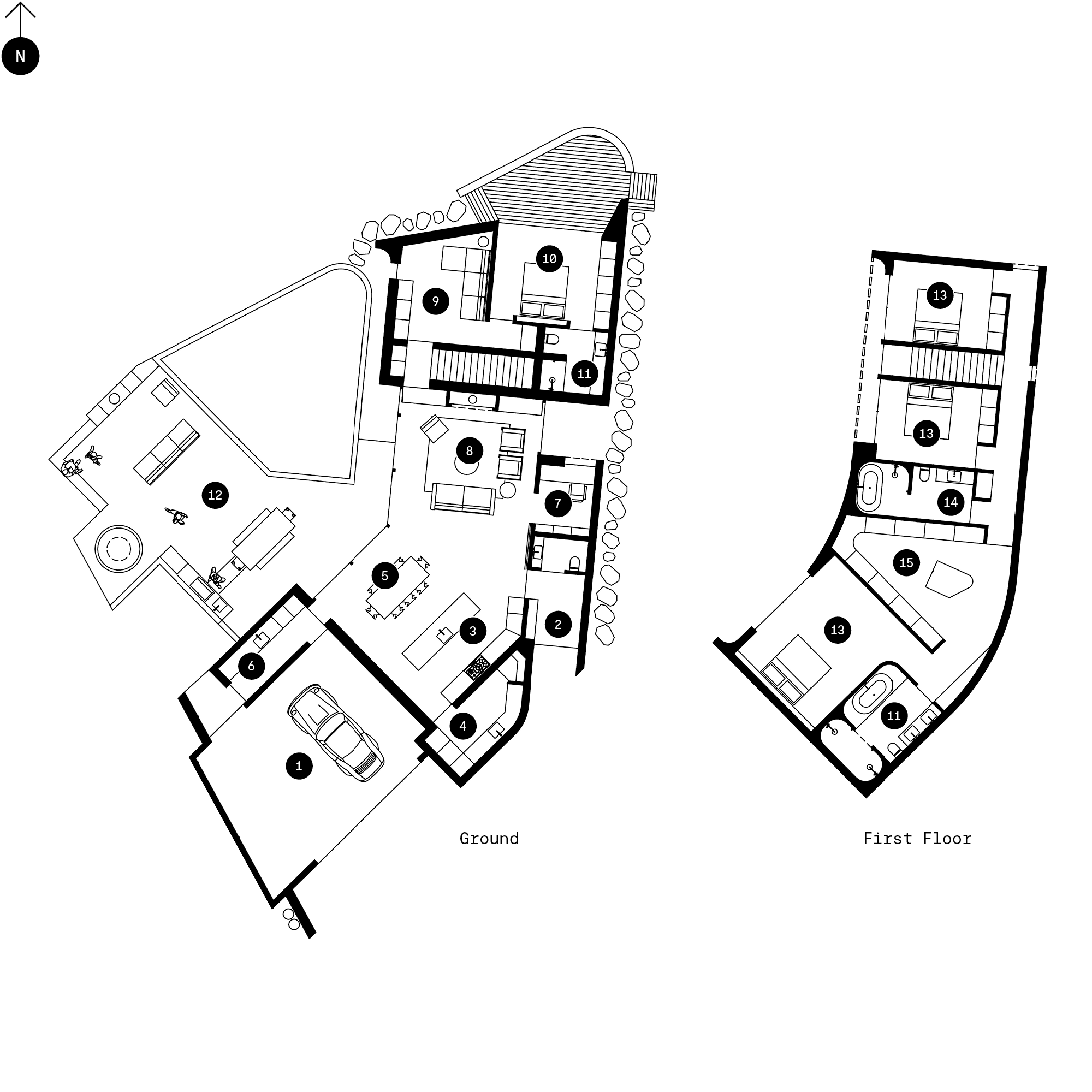
1. Garage
2. Entry Foyer
3. Kitchen
4. Scullery
5. Dining
6. Laundry
7. Office
8. Living
9. Den
10. Guest Bed
11. Ensuite
12. Outdoor Living
13. Bedroom
14. Bathroom
15. Robe
Related Stories: