The New Zealand winners of the Dulux Colour Awards 2026 are beautiful, but they also go to show how colour can be used to evoke stories, history and emotion. “Across this year’s winners, we’re seeing colour applied with real intent,” says Dulux colour expert Davina Harper, “as a foundational design tool that shapes mood, identity and spatial experience.”
The awards have celebrated colour in architecture for 40 years: since 1986, the programme has judged Australian and – for the past 15 years – New Zealand projects, including a Grand Prix winner from each country. Selected by a group of architects and designers, the awards look for projects where colour sits at the centre of the design.
New Zealand’s entries this year were a case in point. Spread across Tāmaki Makaurau Auckland, Tāhuna Queenstown and Ōtepoti Dunedin, and ranging from a harbourside villa to a student landscape concept, they demonstrated a growing confidence in what colour can do. “The strongest projects
had a clear idea, but more importantly, the willingness to stay with it, to keep backing it until it settled into something that felt almost inevitable,” says Buster Caldwell, director of Wonder Group and the New Zealand judge on the jury.
Anchoring space in memory is key: giving a historic Queenstown restaurant its five distinct personalities, guiding walkers through an extinct volcanic landscape on the Otago Peninsula, and acting as an interpreter of memory and a storehouse for precious personal objects in a longtime family home. (Also recognised with a commendation in the Multi Residential Exterior category, Te Pākau Maru by Kāinga Maha demonstrates how colour can shape architecture and social wellbeing.)
More broadly, the judges noted that in residential categories, winners showed contextual appreciation, with colour-drenched homes pulling at the emotions. Bold, warm shades of red, yellow and earthy tones were common. Many projects featured painted ceilings and nuanced details on architraves and skirtings to achieve visual saturation.
In commercial categories, retail was particularly strong, with other-worldly, transportive interiors, glowing and temple-like, and a design approach more associated with exhibitions than traditional retail.
New Zealand Grand Prix
Waka Huia by Pac Studio
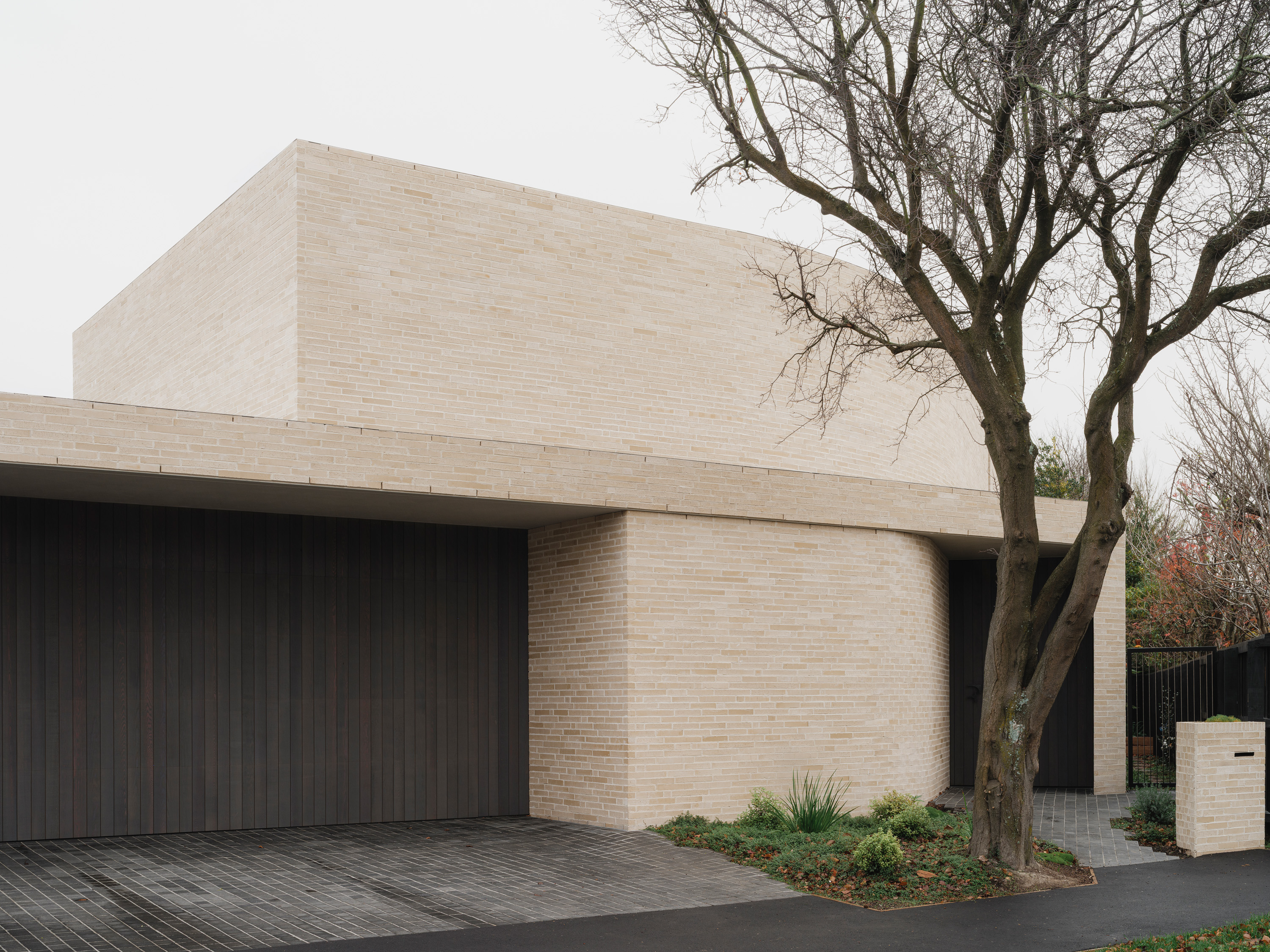
Waka Huia is a harbourside Auckland villa with more than 40 years of art, artefacts and family memory. Pac Studio’s task was to bring coherence to all of it – and they did so through colour. The palette is deeply personal: dining room walls chosen to recall a French railway station once visited; a living room finished in hues selected by the owner’s late wife. In the kitchen: soft pinks and warm brass. In the hallway: a luminous yellow that turns a circulation space into a gallery.
New Zealand student winner
Hot & Cold by Hudson Ross, Otago Polytechnic
Hudson Ross’s student project borrows its name from a children’s game. This proposed four-day walking trail on the Otago Peninsula uses colour as a guide – structures deepen in tone as walkers move closer to the core of an extinct volcano, from a vivid yellow boardwalk near the beach through burnt orange and rust red as the landscape grows more dramatic. The architectural footprint is deliberately light; colour does the orientating.
Commercial Interior – Public and Hospitality
Billy’s, Ayrburn by SA Studio and Alexander & Co
Billy’s occupies a restored 1890s homestead in Queenstown, where SA Studio and Alexander & Co have given it five distinct dining rooms, each with its own identity. One room is rust red, a nod to the celebrated story of a daughter’s red beret. Another is sage green with floral wallpaper, honouring the matriarch’s love of gardening. High-gloss paint on ceilings and walls bounces light off marble and mirrored surfaces, deepening the sense of immersion.
Dulux Colour Awards
Related Stories: